Dimensions: height 205 mm, width 292 mm
Copyright: Rijks Museum: Open Domain
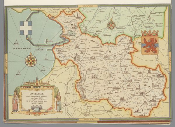
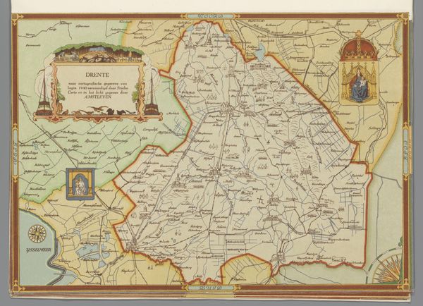
This map of Utrecht was created in 1940 by Studio Certo. The thin, precise lines are the thing, aren't they? Look how they build up to create a picture, layer by layer, a cartographic image built from linear form. The use of color is muted, mostly pale greens and yellows, but it’s the outlines, the delicate filigree of lines, that really makes the piece. It's kind of like a drawing, but it's also a record. I'm drawn to the areas where the lines get really dense, like around the city itself. There's a sense of visual weight there, a feeling of activity and history. Thinking about artists, it reminds me of some of Agnes Martin's grids, but where she was evoking pure space and a feeling of meditative calm, here there's a practical purpose, there’s the suggestion of a place, a time, a world. Ultimately though it is an image, it doesn’t represent an absolute, there’s always room for interpretation, for imagining things differently.
Comments
No comments
Be the first to comment and join the conversation on the ultimate creative platform.
More like this