print, watercolor
#
water colours
# print
#
landscape
#
watercolor
Dimensions: height 206 mm, width 293 mm
Copyright: Rijks Museum: Open Domain
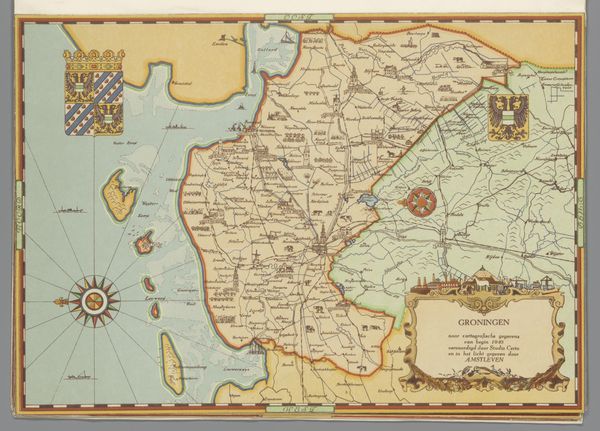
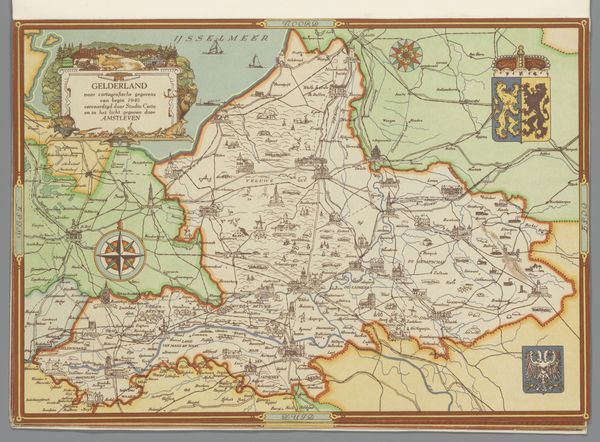
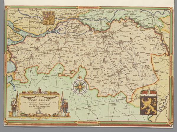
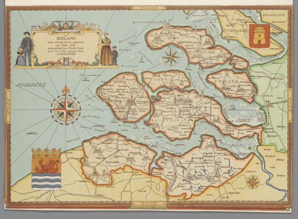
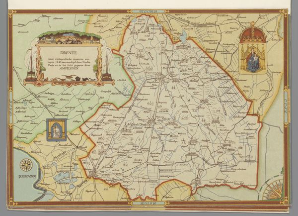
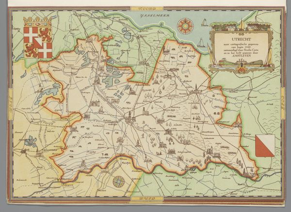
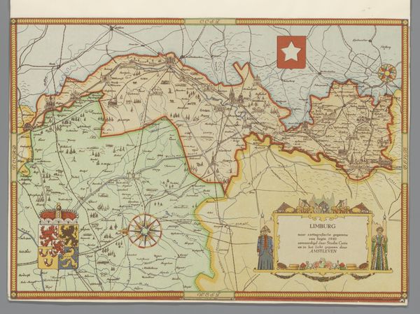
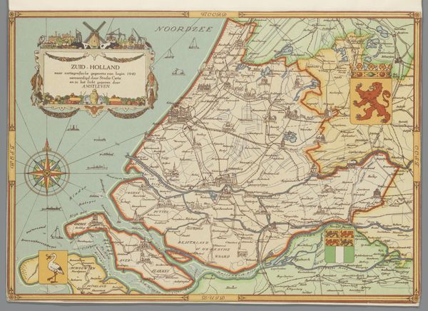
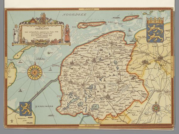
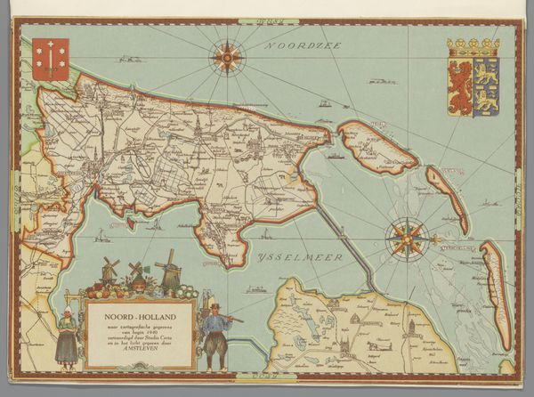
Editor: This charming piece, "Kaart van Overijssel" by Studio Certo, appears to be a watercolor print created around 1947. It's more than just a map; it's an illustrated landscape. How do we read this artwork in relation to its socio-political context? Curator: Well, consider what a map represents – power, control, a claim over territory. Even one rendered in such a picturesque style, like this. Its post-war date is key, suggesting perhaps a redrawing of regional identity following the upheaval of conflict. The symbols – the crest, the figures in traditional dress – are visual assertions of regional pride and a cultural anchor after the war. Do you think that this presentation is innocent or does it hide other intention than only "mapping"? Editor: I hadn't thought about the visual symbols being about redrawing the cultural landscape. I'd say it aims for both precision in cartography and cultural promotion, but it might romanticize reality? Curator: Precisely! Maps are never truly objective. They are always created from a specific viewpoint. The inclusion of local people in traditional dress is interesting. Are they simply decorative or do they make a statement about a population and its cultural preservation in a time of modernisation? How do you see the use of water colours and the traditional style here? Editor: It gives the image a softer, more nostalgic feeling. Instead of modern survey techniques, which would likely seem too sterile after wartime conditions, watercolor and print emphasize handcrafting. This makes the connection to the people stronger and shows it as less mechanical. It builds nostalgia for traditions perhaps disrupted by war and maybe makes it more consumable or socially relevant. Curator: That's a good way to put it. The artistic choice reinforces that desire for a return to a perceived "golden age," a common trope in post-conflict societies. It’s a perfect picture of what the population sees as a common identity. It seems like this work wants to reassure its audience about stability. Editor: It's fascinating how something seemingly simple, like a map, can tell such a complex story about identity, politics, and memory. This helps to frame how important artistic context is.
Comments
No comments
Be the first to comment and join the conversation on the ultimate creative platform.
More like this