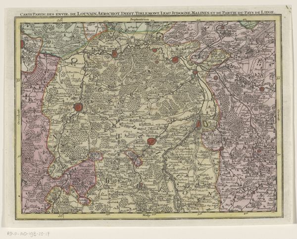
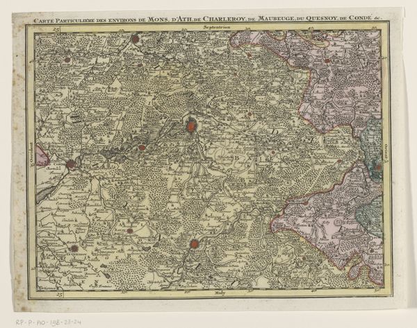
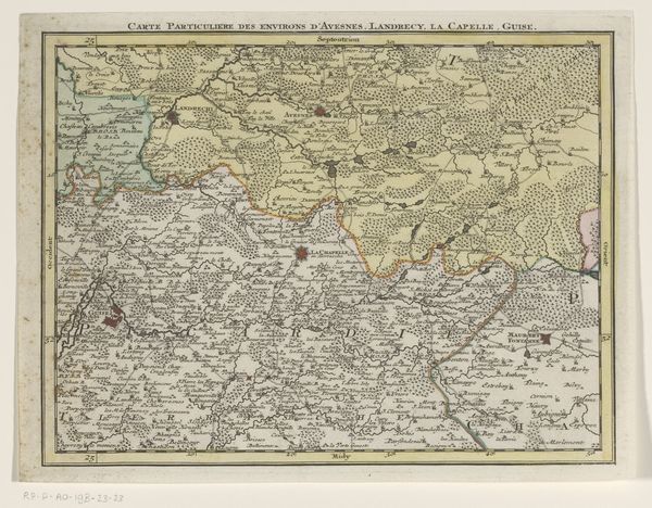
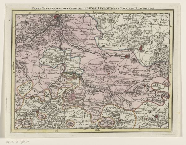
print, etching
#
baroque
# print
#
etching
#
landscape
#
etching
#
history-painting
Dimensions: height 205 mm, width 271 mm
Copyright: Rijks Museum: Open Domain
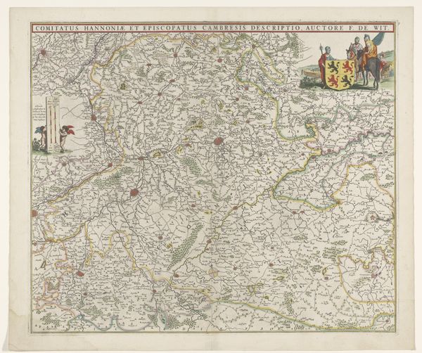
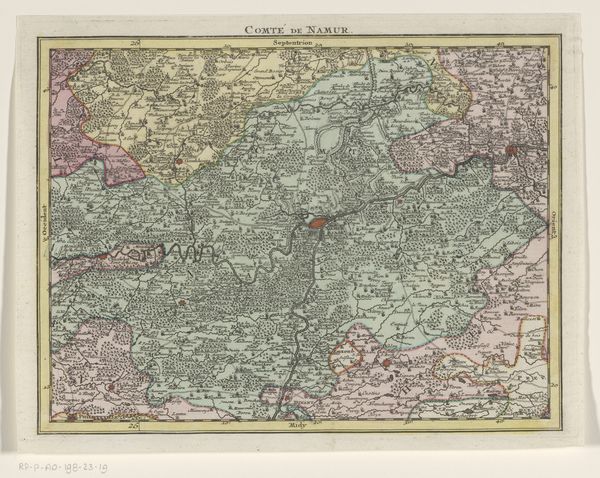
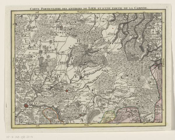
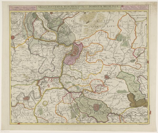
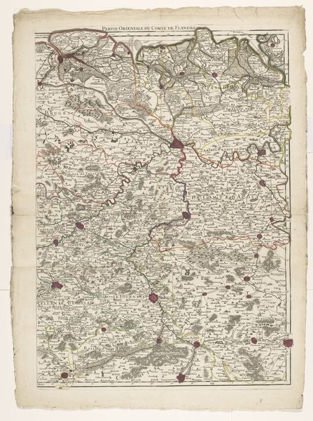
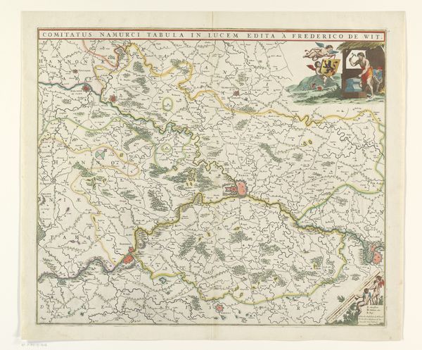
Curator: This cartographic print, rendered via etching between 1737 and 1757, comes to us from Tobias Conrad Lotter and offers "A Portion of a Map of the Austrian Netherlands," at least as far as the translated title suggests. What strikes you upon first viewing? Editor: An almost dizzying array of details, even without color photography as an aid! There's something almost abstract in the close hatching that creates the areas of relief—a formal concern perhaps preceding accurate rendering. Curator: Quite astute. Notice the almost baroque flair even in a utilitarian object. It speaks volumes about the priorities of representation. Consider the status of cartography itself – less about strict accuracy, more about power projection, visual flourish. The dense, layered composition emphasizes certain zones over others. How do you perceive this imbalance? Editor: Well, the river certainly dominates. It cleaves the print into visually distinct zones, influencing the distribution of detail on either side. I'm struck by how the etching emphasizes not just the terrain but the constructed elements—villages denoted with clusters of tiny buildings. Curator: And don't forget those striking crimson highlights scattered about like defiant assertions of presence. Each mark strategically placed within territories claimed by competing aristocratic interests, all vying to wield regional control through visual authority. What do these visual accents suggest to you regarding broader socio-political dynamics? Editor: They operate almost like brandings – a stark, vivid punctuation declaring ownership or highlighting critical hubs of power. They disrupt the supposed objective neutrality of the map, betraying political intent through strategic formal choices. Curator: Indeed. By interweaving the empirical and the aesthetic, we are presented not merely with landmasses but carefully manufactured statements. A cartographic manifesto, if you will. Editor: So, the print, through line and strategically deployed color, makes clear its claim; beyond mere geographic record, it subtly sculpts history’s narrative. Curator: A powerful point indeed. We’ve successfully unpacked the visual strategies employed here, transcending geographical surface to delve into the socio-political undercurrents etched deeply within its formal presentation.
Comments
No comments
Be the first to comment and join the conversation on the ultimate creative platform.
More like this