print, engraving
aged paper
toned paper
page thumbnail
baroque
parchment
old engraving style
landscape
retro 'vintage design
wood background
tea stained
pattern background
cityscape
layered pattern
engraving
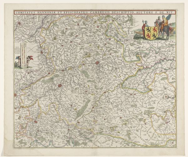
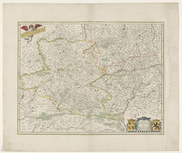
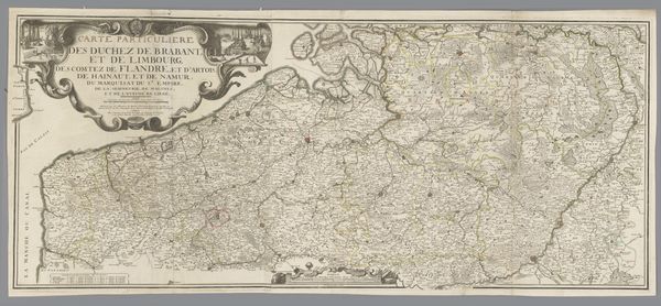
Dimensions: height 470 mm, width 552 mm
Copyright: Rijks Museum: Open Domain
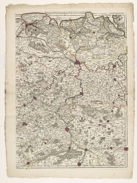
Editor: Here we have an engraving titled "Kaart van het graafschap Namen," or "Map of the County of Namur," dating from 1666 to 1670, from an anonymous artist. The detail is incredible! All the tiny lines give such texture to what is, essentially, a representation of space. How would you interpret this work, considering its formal elements? Curator: Observe how the engraver uses line weight to differentiate territories and waterways, creating visual hierarchies. The subtle application of color washes reinforces this structure. The balanced composition draws the eye across the intricate network of lines and shapes. Consider how these elements contribute to the map's function as both a practical tool and an aesthetic object. Editor: That makes sense. The line weights really do emphasize some areas over others, guiding my eye almost like a landscape painting would. Are the cartouches simply decorative or part of the mapping project? Curator: They are definitely structural and cannot be dismissed simply as decorative. The cartouches’ placement helps balance the composition, but the use of allegorical imagery within these spaces creates a counterpoint with the geometry of the map. In this print, the symbolic figures on top of the map add another narrative layer by highlighting the act of production, therefore acting as a kind of artistic signature or publishing mark. Do you see how that might shift our understanding of its function? Editor: Yes, that emphasizes the craft involved! I hadn't considered that it makes the print both informational and also about artistry itself. It makes me see it differently. Curator: Precisely. Close observation of the visual elements enables a deeper understanding of the artist's intent. The integration of cartographic precision with baroque sensibilities really blurs boundaries in terms of historical interpretations, wouldn’t you say?
Comments
No comments
Be the first to comment and join the conversation on the ultimate creative platform.