drawing, print, paper, watercolor
#
drawing
#
water colours
# print
#
landscape
#
paper
#
watercolor
#
coloured pencil
Dimensions: height 156 mm, width 230 mm
Copyright: Rijks Museum: Open Domain
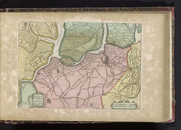
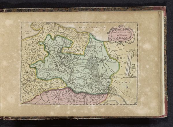
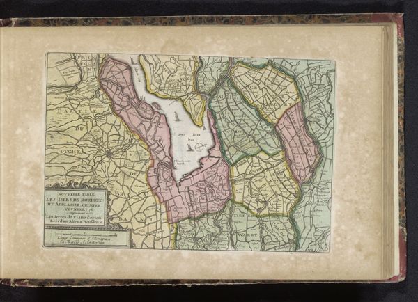
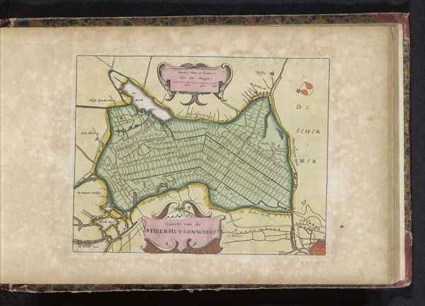
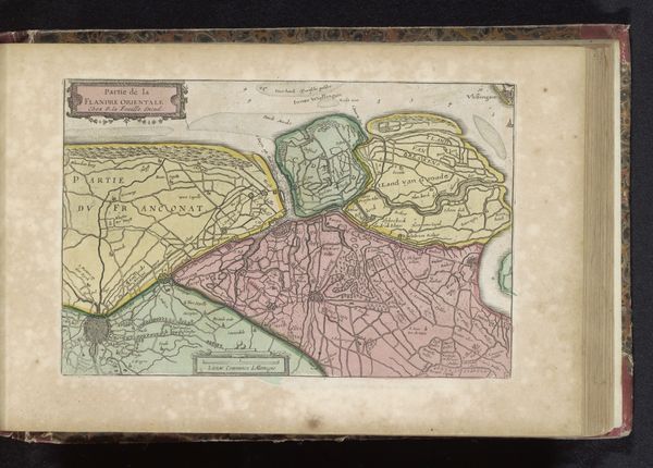
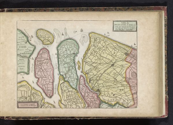
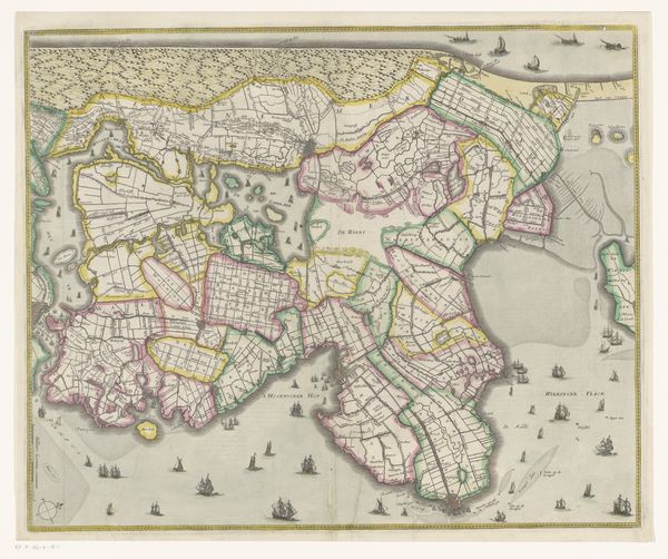
Curator: Here we have an early 18th-century print, likely rendered in watercolor and coloured pencil, titled "Kaart van de Vier Ambachten." It’s an anonymous work, dating from 1700 to 1735. Editor: Immediately, I’m struck by the visual language. The rendering evokes a sense of specificity and place, but it has been filtered by design, resulting in this fascinating aesthetic of calm precision. Curator: Precisely! Note the careful use of line and colour. The varying colours act as demarcation of boundaries, creating geometric forms but maintaining the character of each sector. Editor: The colours give the work a sort of psychological character. Each has its weight: pale rose, verdant green, soft ochre. And what do these forms symbolize within the larger scope of cartography and identity? The colours could reveal claims and ownership. Curator: Consider how each sector is distinct, both autonomous and relational through linear structure. There’s no visual hierarchy, but the scale indicates differing physical areas; yet, there are shared stylistic forms—suggesting social structures are more significant. Editor: True, the graphic qualities also evoke period ideas. In what ways can the image of these land areas become allegorical for community—linking our ideas to our territories and to others who came before? I wonder about trade, societal relations, community strength and character. The symbolism hints at human impact on landscape as a mark of authority. Curator: This cartographic piece also demonstrates the emerging aesthetics of cartography as information delivery through graphical means—it's about how to efficiently and precisely share information visually and accurately, while creating a harmonious experience through formal composition. Editor: The colour adds to the symbolic coding, evoking stability, reliability and cultural values. It’s a coded archive of a society’s ideals, displayed through both what is recorded and what is prioritized. Curator: Indeed, considering both its formal aspects and graphical intent reveals its character; that's key. Editor: Seeing it laid out like this is incredibly informative!
Comments
No comments
Be the first to comment and join the conversation on the ultimate creative platform.
More like this