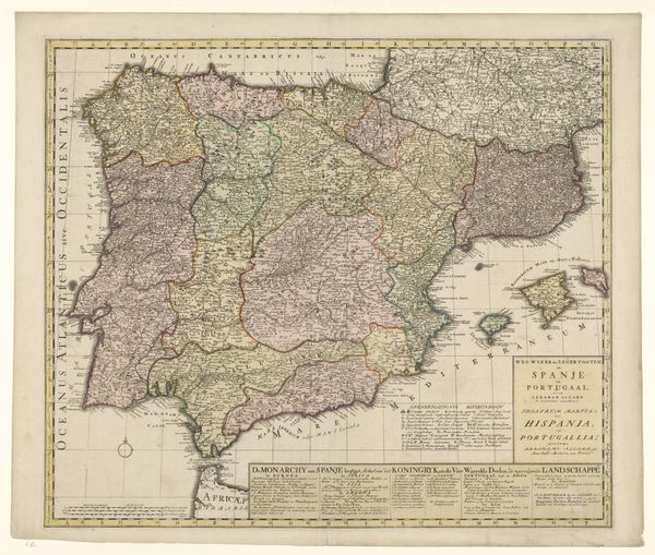
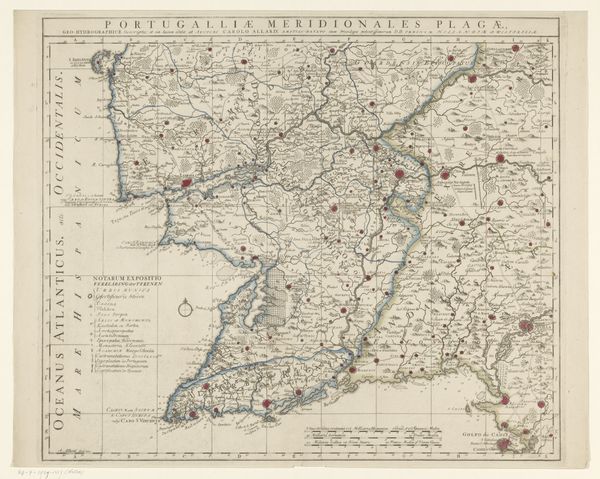
graphic-art, print, paper, engraving
#
graphic-art
#
baroque
# print
#
landscape
#
paper
#
engraving
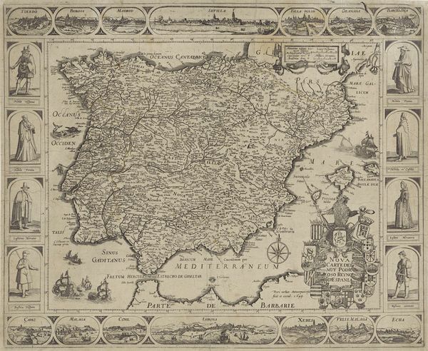
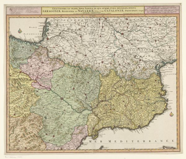
Dimensions: height 511 mm, width 578 mm
Copyright: Rijks Museum: Open Domain
Curator: Here we have "Kaart van Spanje en Portugal," or "Map of Spain and Portugal," a print by Abraham Allard, dating roughly from 1685 to 1725. It's currently held at the Rijksmuseum. Editor: It has a rather imposing air about it, doesn’t it? The tight engraving lines giving a certain weight to the landmasses, the pastel wash adding just the right touch of regal distance. I see a confident assertion of control here. Curator: It's baroque in style, certainly displaying a sense of drama and detail. Look closely at the linear precision – each border, each town carefully etched. The color choices, those subtle variations in tint, delineate political divisions. Allard is clearly interested in articulating structure and order. Editor: Right, structure, but what structure reinforces? I'm struck by the borders themselves. Think about how these cartographic lines solidify power, delineating territories claimed and controlled during a period of intense colonial expansion. This isn't just a neutral depiction of land, it's an assertion of European dominion. Curator: One can appreciate that this print transcends the purely representational through its conscious manipulation of form and structure. The consistent visual language aids comprehensibility; the various fonts used, all within the neat rectangle dedicated to text, evidence formal mastery. Editor: Precisely! It's about how the "official" narrative takes shape through maps. Even the selection of the color palette—those precise washes—might signify how the region was imagined and thus shaped politically by outside forces, contributing to, and reflecting a hierarchical view. Curator: Do you really think that a mapmaker can escape their circumstances when making these choices? Editor: Of course. Think how such images reinforced a developing global understanding – they actively participated in shaping both knowledge and ideology around colonialism. But what strikes you most in regards to its symbolic power? Curator: Ultimately, for me, it remains the composition—the careful balancing of text, territory, and typography—that speaks volumes about the intentions of the artist. It embodies the clarity, the authority, of Enlightenment thought, and that's quite satisfying to note. Editor: I suppose in a world before Google Maps it must have inspired those who relied on it, just knowing such knowledge existed! Thanks for taking the time. Curator: Of course. Thank you for your thoughts on this image.
Comments
No comments
Be the first to comment and join the conversation on the ultimate creative platform.
More like this