drawing, print, engraving
#
drawing
# print
#
old engraving style
#
landscape
#
line
#
sketchbook drawing
#
engraving
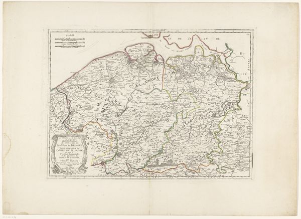
Dimensions: height 436 mm, width 577 mm
Copyright: Rijks Museum: Open Domain
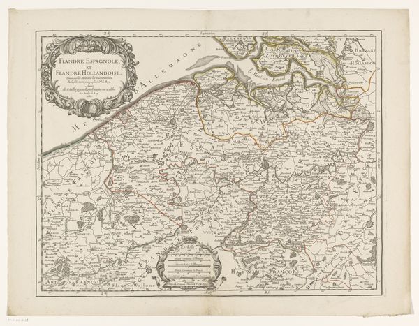
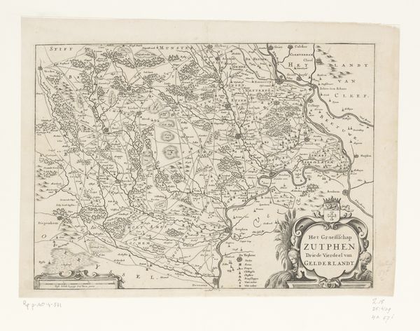
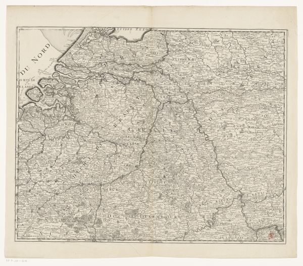
Curator: Here we have an engraving titled "Kaart van het Franse deel van Vlaanderen," or "Map of the French part of Flanders," dating back to 1689. It's from an anonymous artist and part of the Rijksmuseum's collection. It gives me the immediate impression of something seen from a hot air balloon - all ordered, measured, and yet slightly…distant. Editor: Yes, there’s an undeniable sense of detachment. Formally, the dominance of line—crisp, unwavering—dictates the terms of engagement. Note how the landscape elements are rendered in a stark, almost diagrammatic fashion. The shading and detail are meticulously applied. The cartography seems objective and precise in its execution. Curator: I get lost wondering about the artist’s hands. Each of these tiny lines, decisions, about placement, how deliberate, controlled by who's interest... It feels almost secretive. Was it truly for wayfinding or a projection of power? I can imagine them pouring over tables lit by candles. So evocative of a time when mapping itself was power. Editor: Exactly, because cartography, through a visual language of symbols and text, establishes a dominant discourse. The clean lines create a visual structure suggesting a well-ordered, and implicitly governable, space. Observe the clear demarcation of borders – Flanders and other territories – which act as semiotic signifiers defining ownership and control in a fractured landscape of allegiances. Curator: I love how you ground my airy musings with sharp observations. When I view these borders, I picture walking those same landscapes depicted. And it's wild how much is left out...the real tangible stuff. I get stuck on the tiny flourishes though – little windmills sprinkled across fields like rebellious thoughts in a king’s head. A secret life under these sharp lines! Editor: A whimsical interpretation, but it highlights an important point. We impose narrative to animate otherwise dead lines. A line can both isolate a community through political division, but visually binds all these elements and communities together. So although Flanders appears clearly articulated, the relationship with “Mer d’Allemagne” suggests an intrinsic relationship and co-dependence with the broader North Sea landscape. The interplay, if not tension, in its composition. Curator: In a way, these lines also echo our role interpreting artwork. We bring our own boundaries and stories to see things in a specific way, both uniting and dividing what something truly “means." I think, simply, it means there is endless new beauty that comes from exploring both the limits of order and creative space. Editor: Indeed. "Kaart van het Franse deel van Vlaanderen" offers a space not just for navigation through the land it depicts, but also a critical contemplation of what we bring to its viewing and appreciation.
Comments
No comments
Be the first to comment and join the conversation on the ultimate creative platform.
More like this