rippled sketch texture
aged paper
naturalistic pattern
old engraving style
wood background
botanical drawing
natural palette
layered pattern
botanical art
warm toned green
Dimensions: height 75 cm, width 50 cm
Copyright: Rijks Museum: Open Domain
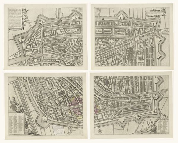
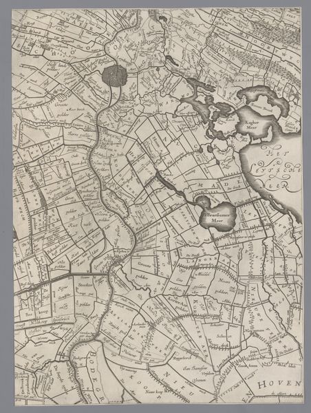
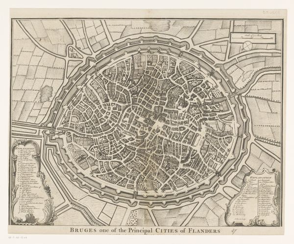
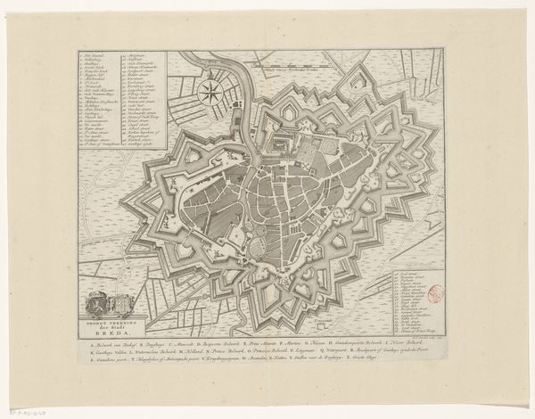
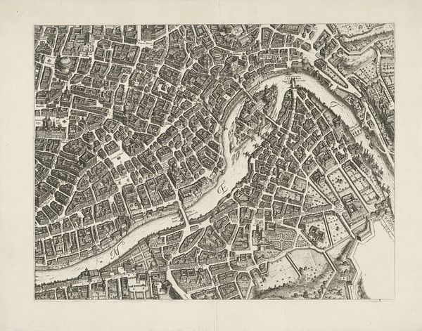
Editor: This is "Geographia," a pictorial map of London created around 1940 by Geographia Ltd. The earthy tones and detailed linework give it an antiquated feel. I’m immediately struck by how the layout of the city seems to create a complex, almost organic pattern. What do you see in this piece, considering its formal elements? Curator: It is a compelling piece, isn't it? I find its structure particularly intriguing. Consider the way the artist utilizes contrasting colors: the warm browns of the city fabric set against the cool greens of the parks. Note also how the density of the street layout creates a certain visual rhythm, balanced by the open spaces. The lines are the form of streets and, the relationship among these streets constitutes a whole network, one that allows London’s functions and characteristics as a megapolis. The structure of the city comes alive on this very canvas. Editor: The parks certainly offer a visual break. But do you think that color contrast also enhances our understanding of how spaces function and relate? Curator: Precisely. Notice that the cool tones for the Thames also delineate a distinction of a body that divides two areas into South and North. In terms of formalism, color and light function beyond aesthetics to provide depth and complexity. Furthermore, the visual cues highlight the various regions or sectors within London that comprise a diverse urban landscape. It could suggest that function follows form, not in an empirical way, but how aesthetics affect human movement and emotion. Editor: That makes me look at it in a completely new way. I guess I was too focused on what the map *represented* rather than how it was constructed as a piece of art itself. Curator: Exactly! Shifting the focus to its structure allows one to decode how meaning is generated. We began with a pictorial of London, then by carefully examining its colors, line types, shading density, and network relationships, a whole new idea emerges beyond representation. That opens another horizon for exploration, wouldn't you agree? Editor: I definitely do. Thank you for showing how focusing on the elements themselves can reveal so much. It is the most comprehensive explanation that I heard for a pictorial and painting work.
Comments
No comments
Be the first to comment and join the conversation on the ultimate creative platform.
More like this