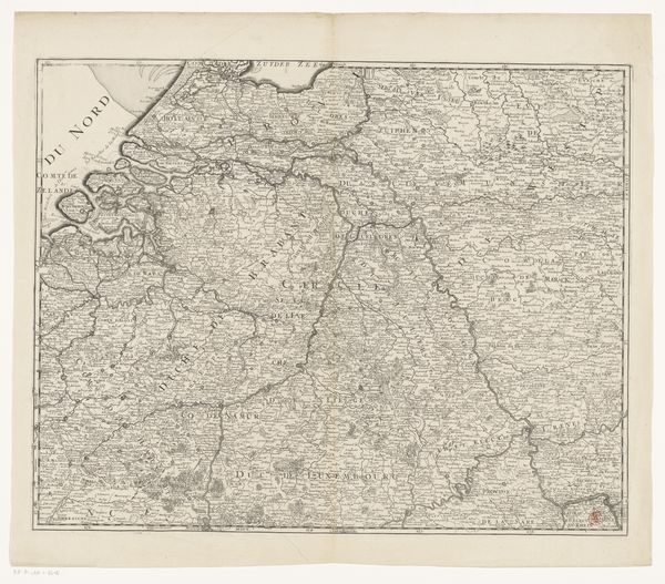
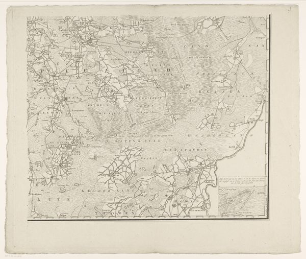
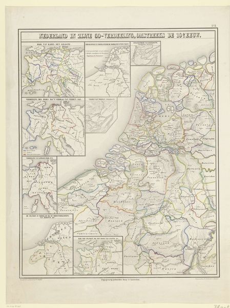
Kaart van de provincies Holland, Utrecht en Gelderland waarop met kleuren is aangegeven tot hoever de Fransen in 1672 waren doorgedrongen en welke delen door inundatie beveiligd waren 1830 - 1853
0:00
0:00
anonymous
Rijksmuseum
print, etching, engraving
#
dutch-golden-age
# print
#
etching
#
old engraving style
#
etching
#
history-painting
#
engraving
Dimensions: height 205 mm, width 229 mm
Copyright: Rijks Museum: Open Domain
Curator: Isn’t it striking how old maps can evoke such intense emotions? This one, created anonymously between 1830 and 1853, is titled "Kaart van de provincies Holland, Utrecht en Gelderland..." it depicts the provinces of Holland, Utrecht, and Gelderland, marking the extent of the French invasion in 1672. Editor: It’s so evocative! Immediately, I sense a stark, almost clinical overview masking deep anxiety. The precise lines and careful color-coding…it’s like someone trying to impose order on chaos. Curator: Exactly! Look at how the artist uses different colors to show the areas invaded versus those saved by strategic flooding – inundation. See how the darker shades seem to encroach? The formal, controlled aesthetic is juxtaposed against the volatile subject matter, creating a powerful tension. Editor: The use of etching and engraving also adds to this feeling of distance, doesn’t it? It’s as if we're viewing a pivotal historical moment through layers of crafted objectivity, yet the inherent drama can’t be fully contained by the medium. Curator: The choice to omit certain details adds to the feeling, too, don't you think? Notice how some towns are meticulously labeled while others fade into the background. It directs your focus and subtly shapes the narrative being conveyed. What untold stories linger in those omissions? Editor: The composition certainly channels how the provinces saw themselves and their resistance—or vulnerability, perhaps—in the face of the invasion. Even though the artwork presents a relatively objective bird's-eye perspective, you know so much political messaging would have found its way into choices about the visual syntax and tone of the representation! Curator: Absolutely. In a way, it’s a poignant testament to the power of art to compress time, isn't it? It’s like compressing conflict into a two-dimensional visual, an era’s fears captured in ink, right here in the Rijksmuseum. Editor: Precisely. Maps often hide behind their supposed neutrality, but this one pulses with history. You feel both the intellect and imagination involved in laying out the scene as much as in feeling through this key moment.
Comments
No comments
Be the first to comment and join the conversation on the ultimate creative platform.
More like this