drawing, print, paper, watercolor
#
drawing
#
water colours
#
baroque
#
dutch-golden-age
# print
#
landscape
#
figuration
#
paper
#
personal sketchbook
#
watercolor
#
coloured pencil
#
genre-painting
#
watercolor
#
realism
Dimensions: height 146 mm, width 225 mm
Copyright: Rijks Museum: Open Domain
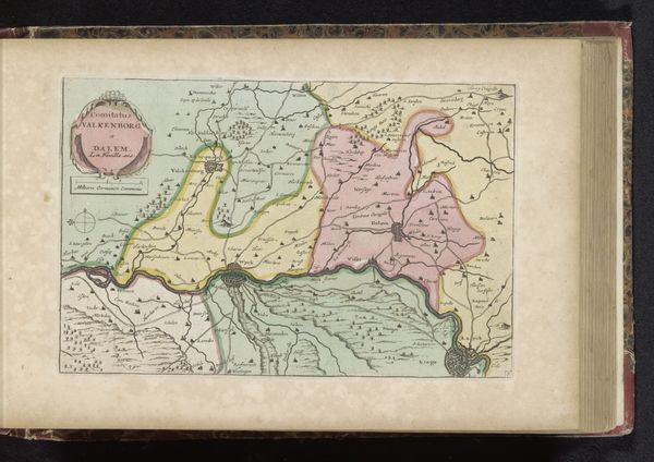
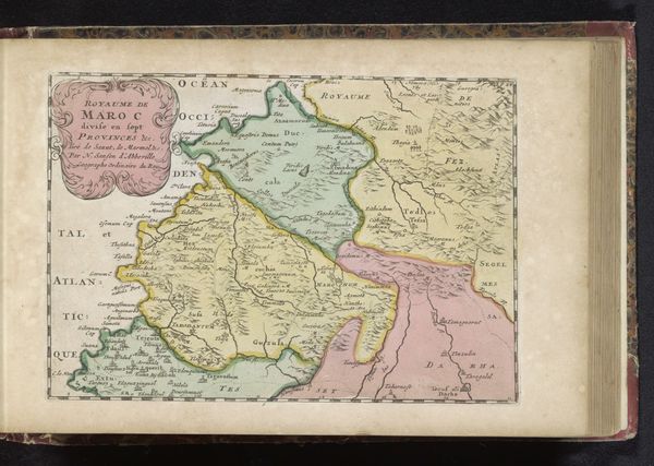
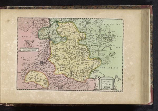
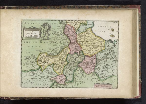
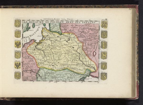
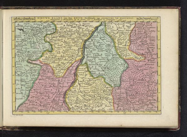
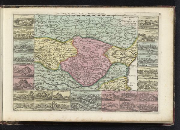
Curator: Before us is “Kaart van Overijssel,” an anonymous drawing rendered in watercolor, likely between 1700 and 1735. It appears to be a plate from an atlas or travel journal, doesn't it? Editor: It does indeed. My first impression is one of measured precision. The subdued palette – soft yellows, pinks, greens – is rather soothing, belying the inherent purpose of such a functional object. There’s an inherent artistry in its execution. Curator: Precisely. The structural rendering reveals a clear understanding of spatial relationships. Note how the cartographer delineates different regions through carefully modulated color fields. The consistency in line weight and lettering style contribute to its balanced composition. Editor: The prominence of waterways suggests their vital role in commerce and communication. Consider the symbols – the arrangement of trees denoting forests, or perhaps the clusters indicating settlements. What do they convey about the region’s economic and social structures at the time? Are there any culturally specific visual cues? Curator: Good question. It is worthwhile observing how the cartographer privileges particular locations, rendering some in more detail than others. What narrative does the maker implicitly propose through these selective amplifications and omissions? It is evident that objectivity itself cannot exist in such visual representations. Editor: The compass rose, an enduring symbol of guidance and exploration, surely suggests a sense of adventure. Even within the seemingly rigid framework of a map, we find layers of cultural projection. The colors might even imply particular political alliances, right? Curator: Perhaps, but the colour scheme's systematic division provides a compelling demonstration of early modern representational techniques, wouldn't you agree? Note the subtle gradations within each colour field and the interplay of positive and negative space. Editor: Absolutely. When viewing this drawing as a visual object, beyond just data, a richer symbolic understanding begins to materialize. Thank you for illuminating these key aspects. Curator: And thank you, the dialogue between form and content has undoubtedly revealed new dimensions for consideration.
Comments
No comments
Be the first to comment and join the conversation on the ultimate creative platform.
More like this