painting, watercolor
#
baroque
#
painting
#
landscape
#
watercolor
#
geometric
Dimensions: height 171 mm, width 258 mm
Copyright: Rijks Museum: Open Domain
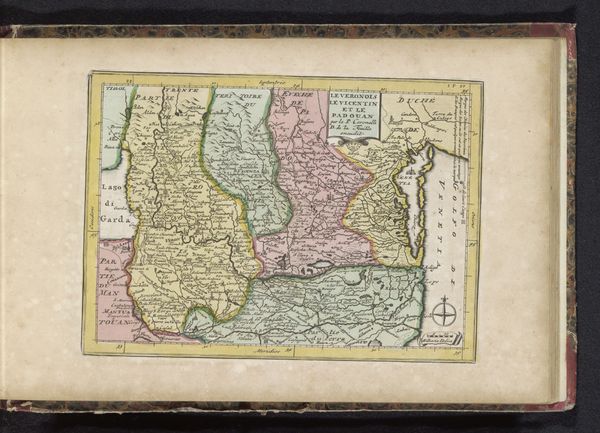
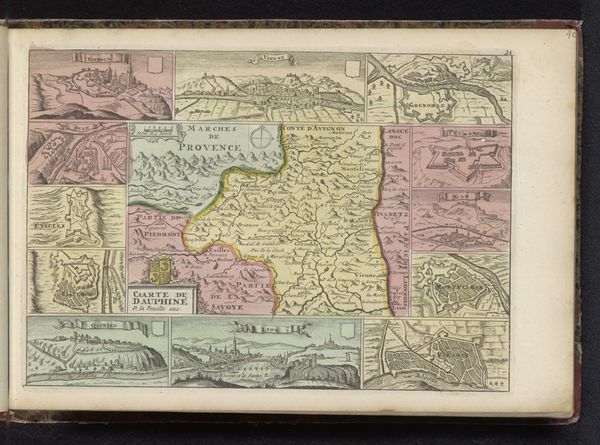
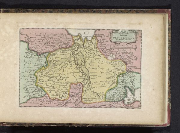
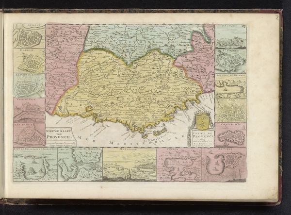
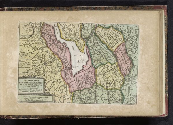
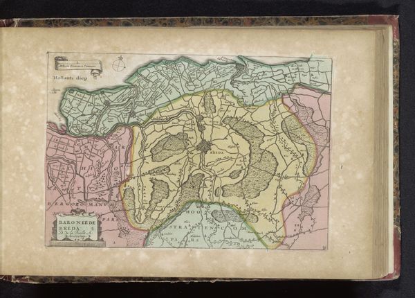
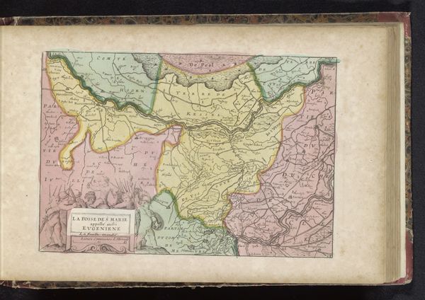
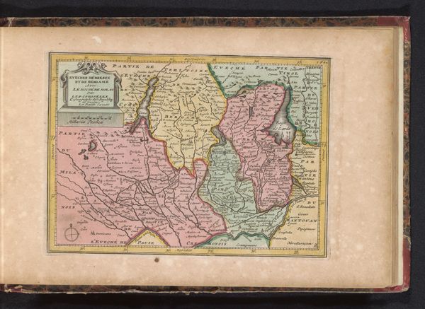
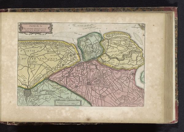
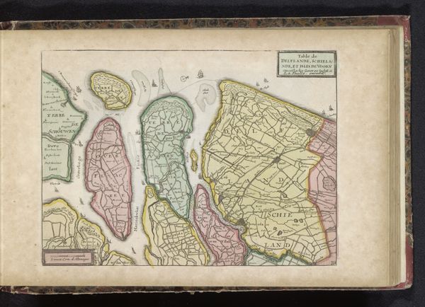
Editor: So, this is Jan van Jagen's "Kaart van de Rijn" from 1735, done in watercolor. I am struck by the rather dreamlike quality of it. The pastel hues lend a kind of ethereal quality to the rendering of the Rhine. What meaning can be deciphered from a map like this? Curator: It’s more than just directions. It is a cultural document deeply embedded with symbolic geography. Notice how different territories are defined not just by lines, but also by color? Each hue represents power, ownership, and cultural identity projected onto the land. It's a claim, visualized. Editor: A claim? You mean, like a power statement? Curator: Precisely! The symbols are subtle, but persuasive. Consider the very act of mapping, fixing territory and resources onto paper. It's a potent psychological act. The act of naming bestows a symbolic ownership as well. It's baroque not just in its ornamentation, but in its persuasive power. Consider, too, the consistent rendering of certain topographical features – hills, settlements. Are they accurate, or idealized? Editor: I see your point. Maybe these maps were made to impress rather than navigate? Curator: Perhaps to impress, to assert dominance, and to implant a cultural narrative onto the landscape. Each tiny tree and carefully placed village serves a purpose in reinforcing this vision of control. The visual grammar employed here conveys as much historical data as anything written. What lasting impact might this kind of cartography have had on perceptions of identity and territory? Editor: It's fascinating how much symbolism can be packed into something as seemingly straightforward as a map. I will never see a map the same way again. Curator: Indeed. And understanding these ingrained visual cues grants us access into their intended emotional, cultural and political world.
Comments
No comments
Be the first to comment and join the conversation on the ultimate creative platform.
More like this