drawing, print, etching, paper
#
drawing
# print
#
etching
#
etching
#
paper
#
geometric
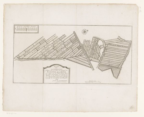
Dimensions: height 497 mm, width 569 mm
Copyright: Rijks Museum: Open Domain
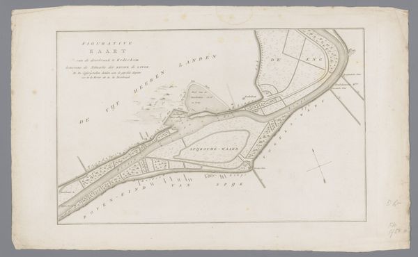
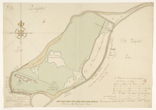
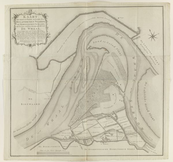
Editor: Here we have a map, "Kaart van het eiland Rozenburg", or "Map of the island of Rozenburg," made in 1727. It seems to be an etching on paper. The land divisions are quite striking. What catches your eye when you look at this piece? Curator: Initially, the austere linearity defining the piece strikes me. Observe how the geometric organization imposes an abstract order, dividing the space. We can see a clear system of demarcation dictating the composition, emphasizing the calculated allocation of space over representational accuracy. Note, too, the precision in the inscription, which lends the piece a distinctly formal quality. Editor: So, the arrangement of the forms takes precedence over, say, the realistic depiction of the landscape itself? Curator: Precisely. It is more aligned to formal elements such as shape, line, and textual integration. How does this influence your perception of the image? Editor: It definitely highlights the intended purpose. It’s less about capturing the feel of Rozenburg, and more about… documenting its measurable aspects, creating a legible system. So, would you say the impact comes from understanding the visual language, rather than any particular emotion? Curator: Indeed. It invites contemplation of form and order rather than emotive engagement, doesn't it? Consider how our understanding evolves as we decode its inherent system. Editor: Absolutely! Seeing the work this way allows me to appreciate its intentional construction as opposed to what I previously understood to be just a regular geographical illustration. Thanks!
Comments
No comments
Be the first to comment and join the conversation on the ultimate creative platform.
More like this