drawing, print, ink, engraving
#
drawing
#
baroque
# print
#
landscape
#
ink
#
engraving
Dimensions: height 420 mm, width 545 mm
Copyright: Rijks Museum: Open Domain
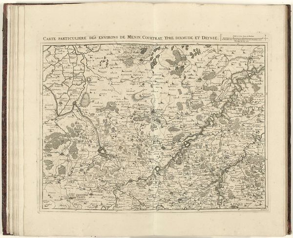
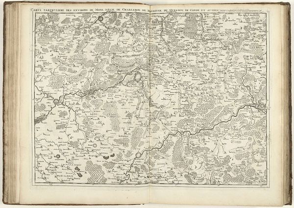
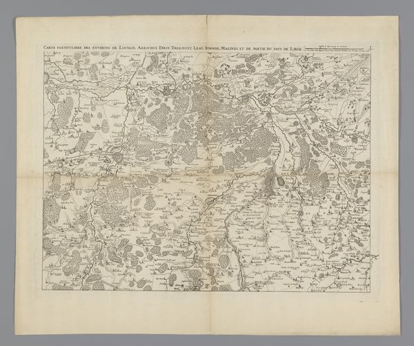
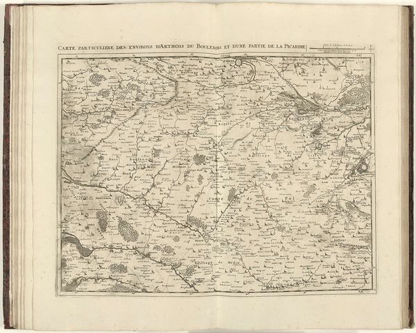
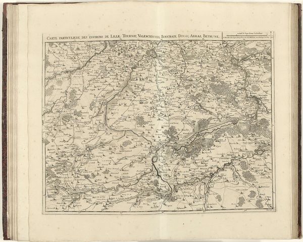
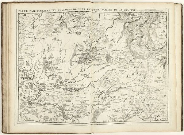
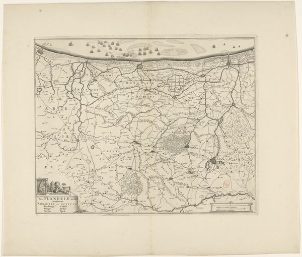
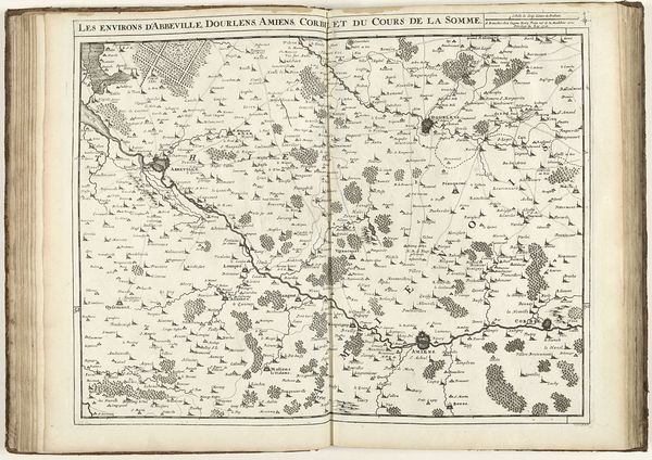
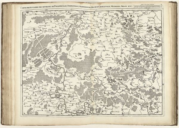
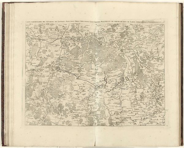
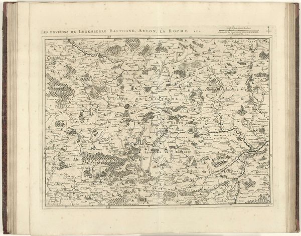
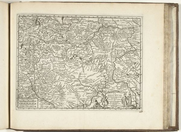
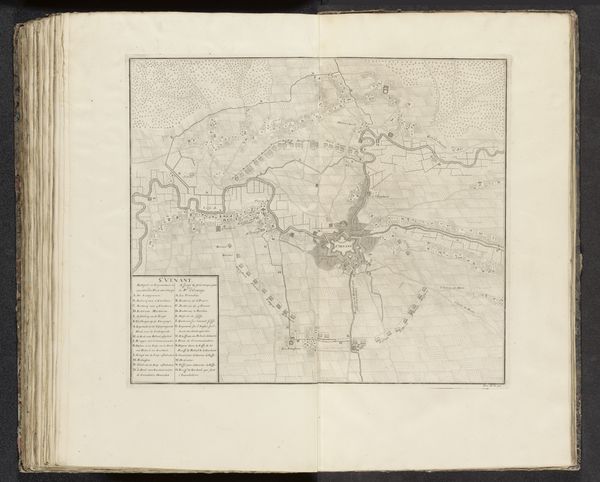
Editor: Here we have Jacobus Harrewijn's map of the province of Namur, created between 1706 and 1712, rendered in ink through engraving and drawing. It looks incredibly detailed. How do you read this image? Curator: Well, let's start with the obvious: this map, while seemingly an objective representation of space, is utterly dependent on the socio-economic forces that produced it. The engraving process itself—the labor, the cost of materials like copper, ink, and paper—speaks volumes about the period. Consider the purpose: who commissioned this map and what did they intend to use it for? Editor: I hadn’t considered that. I was mainly looking at it aesthetically, the details of the landscapes… but I suppose this wasn't made for aesthetic purposes. Curator: Precisely. This wasn't about capturing natural beauty. Mapping served very real purposes – control of land, taxation, military strategy. Look at the precision of the lines. This reflects skilled craftsmanship, a specialized labor force and also power and control. What can we infer from what is emphasized—the rivers, the towns, the roads? What does that say about what was most valued and exploitable at the time? Editor: So, it's not just about the “what” but the “how” and “why” it was made that’s key here. It is like a commodity. Who had access to it then? Curator: Exactly. It likely wasn’t a widespread household object. Its availability, dictated by production cost and the target audience, reflected existing power structures. Maps are rarely neutral objects; they are tools reflecting specific agendas. Editor: Right. I see now how analyzing its creation sheds light on the society that created it, as well as who benefited from that. Curator: Agreed, focusing on materiality helps reveal the deeper political and economic underpinnings of what might appear at first glance a beautiful drawing.
Comments
No comments
Be the first to comment and join the conversation on the ultimate creative platform.
More like this