print, paper, engraving
#
baroque
# print
#
paper
#
engraving
Dimensions: height 392 mm, width 497 mm
Copyright: Rijks Museum: Open Domain
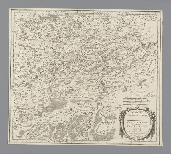
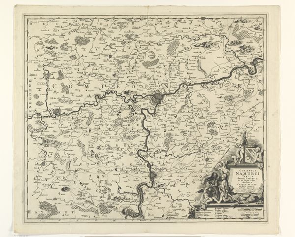
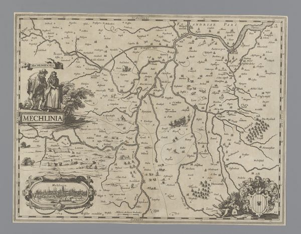
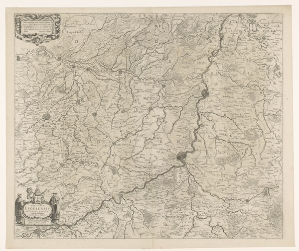
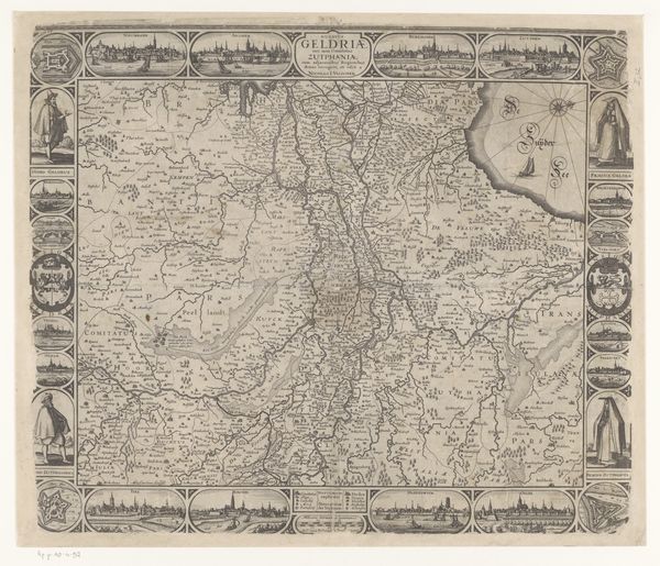
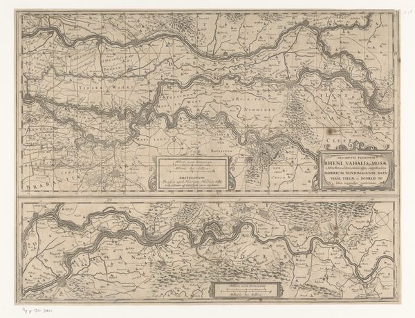
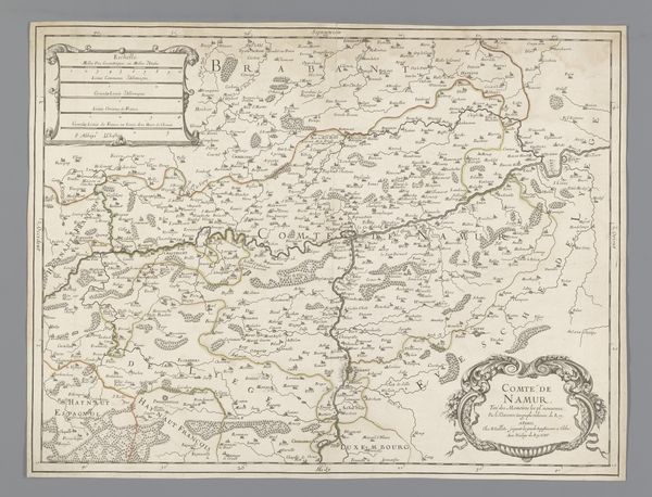
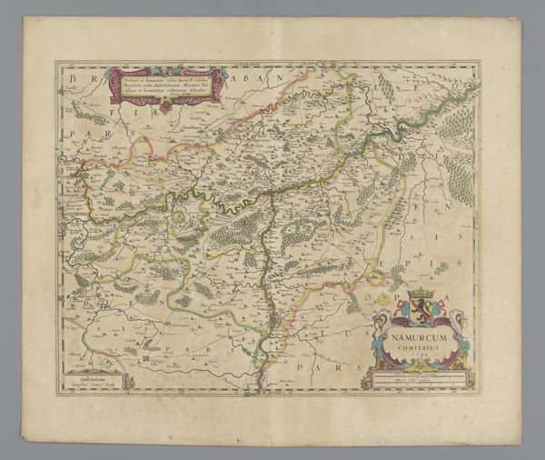
Curator: Here we have an engraving dating from 1632-1649, entitled "Kaart van het graafschap Namen," which translates to "Map of the County of Namur." It is a baroque-style print, made with engraving on paper, and held at the Rijksmuseum. Editor: My first impression is that this map looks like the kind of place you could get gloriously lost. So detailed, so many tiny trees and winding roads... feels almost dreamlike, even though it's meant to be factual. Curator: Indeed. Maps, especially during this era, were never solely about geographic accuracy. This particular map needs to be considered alongside the socio-political tensions of the time. Namur was a strategically vital region, caught between various European powers, especially Spain and the Dutch Republic. Mapmaking, therefore, became an assertion of power. Editor: Right, it’s like drawing a line in the sand, but with trees and little castles instead of sand. It's also interesting how stylized the landscape is. Each little hill seems to have a personality, and the forests look more decorative than... foreboding. Like something out of a fairy tale, really. Curator: This stylization is, in itself, revealing. The Baroque, in particular, loved ornament. Here it can be seen influencing even cartography. Notice how the borders are not simply lines but are elaborate, decorative elements – particularly around the title and dedication at the top and bottom. These aren't merely functional, they also add a layer of authority and importance to the work, visually staking a claim. Editor: I get it, you’re not just showing people where to go, but telling them who's in charge. Plus, all the different patterns used to represent fields and forests, it must have been quite the process to produce this! Almost meditative, etching away to create such a complex image of belonging. Curator: Precisely. It also invites us to reflect on whose perspectives are prioritized. Who would have been the likely commissioners and audience for such an elaborate map? How might the experience of peasantry living on that land diverge from that representation? These are important considerations. Editor: Absolutely. Looking at this beautiful object, with all its precise detail, also sparks a deeper question: how does the act of mapping—of representing a place—affect our relationship to it? It's almost like taking a photo; the map becomes its own reality and makes the real thing exist a little differently. Curator: A critical point, one that continues to resonate in our contemporary moment as we contend with data visualization and power. I’m always struck by what maps choose to highlight – and equally, what is left in the margins. Editor: For me, this isn't just an historical artifact, it's a reminder that perspective is everything, and that even the most ‘objective’ representations are shaped by our values, whether we realize it or not.
Comments
No comments
Be the first to comment and join the conversation on the ultimate creative platform.
More like this