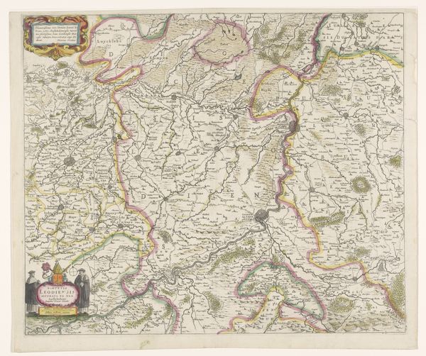
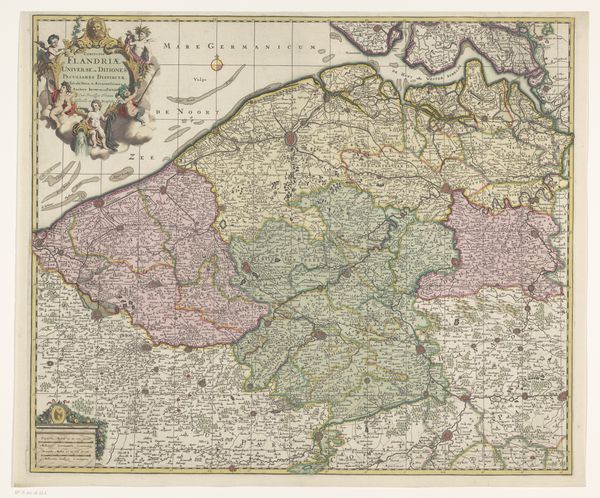
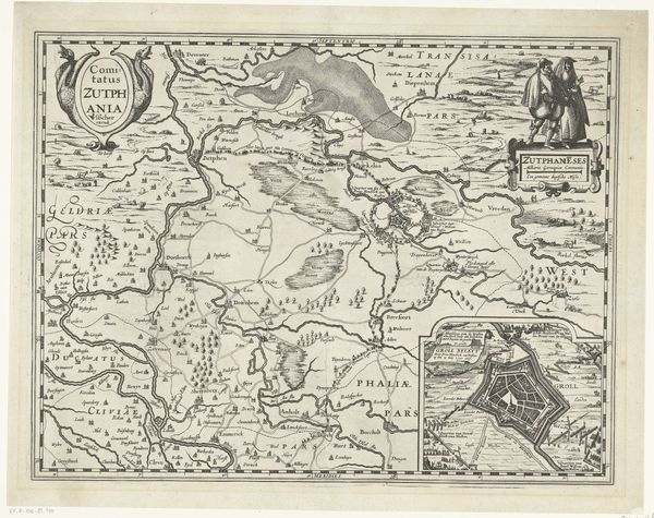
graphic-art, print, engraving
#
pen and ink
#
graphic-art
#
dutch-golden-age
# print
#
landscape
#
geometric
#
line
#
engraving
Dimensions: height 186 mm, width 253 mm
Copyright: Rijks Museum: Open Domain
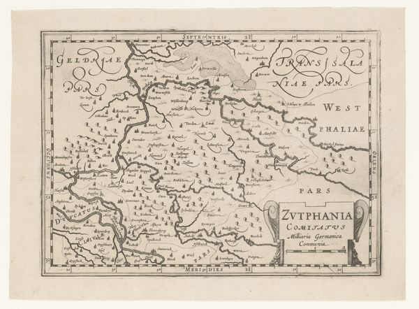
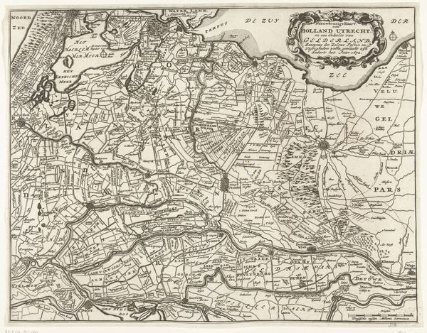
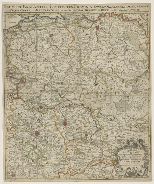
Editor: We're looking at "Kaart van de provincie Utrecht," a map of the province of Utrecht, made sometime between 1580 and 1630 by Pieter van der Keere. It’s a pen and ink engraving. I'm immediately struck by how incredibly detailed it is. It makes me wonder, what do you see when you look at this piece, especially knowing what life was like then? Curator: This isn’t just a map, you know. It's a story etched in ink! I imagine Van der Keere meticulously crafting each line, probably by candlelight, and each place name, town and river tells of human activity. The overall composition shows us more than landmass; it subtly highlights power, influence and our old friend... trade routes! The flourishes and tiny sailboats, and what looks to be buildings in each city... Editor: Sailboats! I hadn’t noticed them at first glance. Why include those embellishments on what is, essentially, supposed to be a practical document? Curator: Exactly! It suggests a sense of pride and possibly an appeal to wealthy merchants of the time. They remind the map user, possibly a wealthy tradesman or aristocrat, of the vibrant economy the waterways supported. Think of it as the 17th-century version of adding a fancy logo to your business card. It elevates the status, doesn't it? Does spotting those details make you feel a connection with people who existed 400 years ago? Editor: Absolutely, it's like a tiny time machine. Now I want to dive even deeper into every little flourish. Thanks, that was enlightening. Curator: My pleasure. Who knew maps could be so…poetic?
Comments
No comments
Be the first to comment and join the conversation on the ultimate creative platform.
More like this