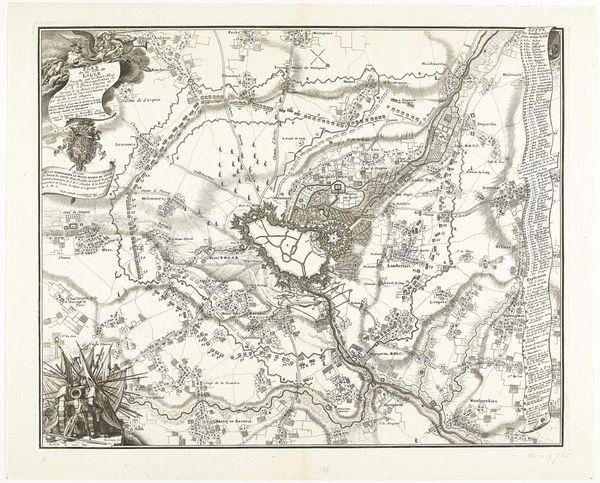
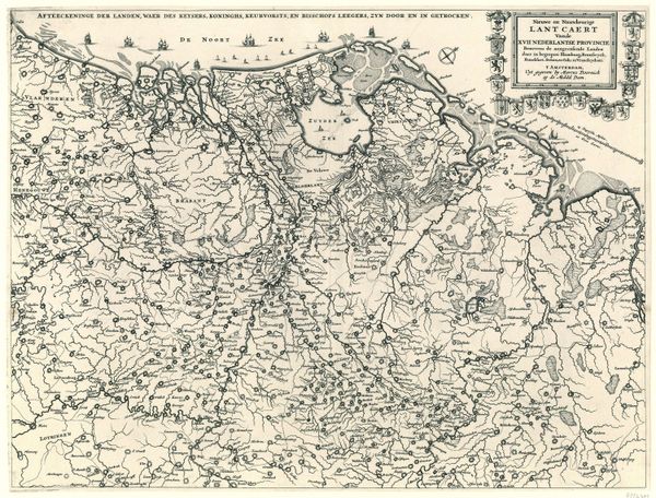
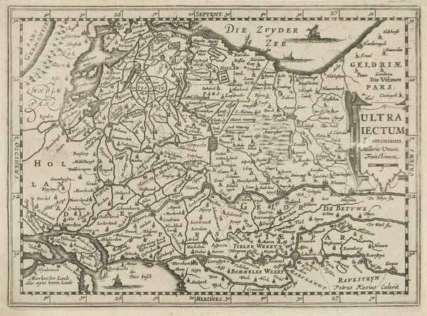
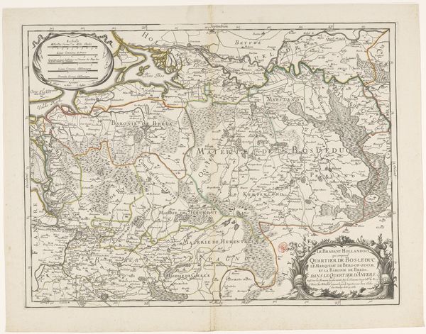
Kaart van de provincies Holland, Utrecht en Gelderland met de vestingen en forten gebouwd tijdens de oorlog in 1672 1672 - 1699
0:00
0:00
drawing, print, ink, engraving
#
drawing
#
dutch-golden-age
# print
#
pen illustration
#
pen sketch
#
landscape
#
ink line art
#
ink
#
pen-ink sketch
#
pen work
#
cityscape
#
engraving
Dimensions: height 293 mm, width 375 mm
Copyright: Rijks Museum: Open Domain
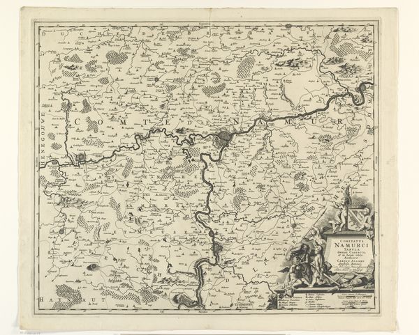
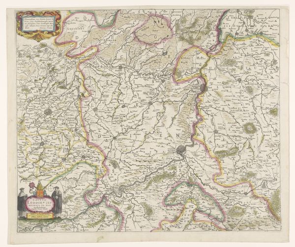
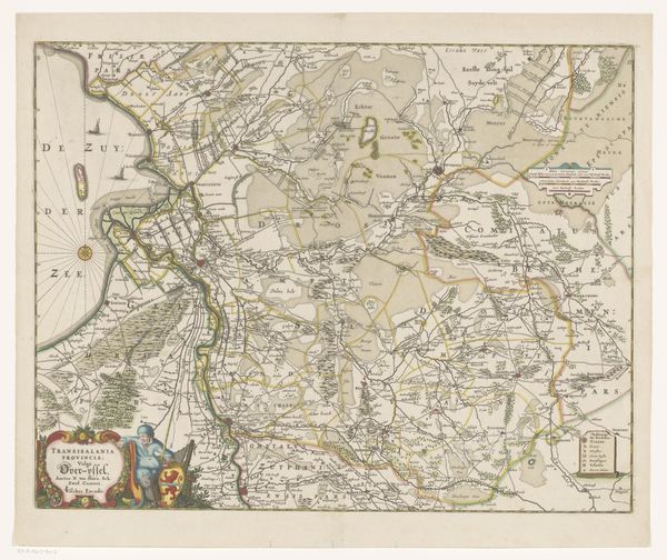
Editor: Here we have an anonymous print from between 1672 and 1699, titled "Kaart van de provincies Holland, Utrecht en Gelderland met de vestingen en forten gebouwd tijdens de oorlog in 1672." It seems to be a map rendered in ink and engraving. The detail is really striking. What elements of its composition stand out to you? Curator: I am struck by the work's elaborate deployment of line. Notice how the varied thickness articulates different spatial relationships. Thick, bold lines define provincial borders and major waterways, visually asserting their dominance within the pictorial field. What do you make of the texture created by the hatching? Editor: It does create depth, doesn't it? Almost a feeling of volume, particularly in the areas representing land. So the density of the hatching perhaps communicates the significance or value of certain territories? Curator: Precisely. The density contributes to a kind of visual weighting. Moreover, the topography, differentiated by subtle shifts in linework, indicates the tension between natural form and imposed order. Do you see how the calligraphic quality of the text merges with the landscape itself? Editor: Yes, the lettering, although informative, really blends with the overall image. So, even functional elements contribute to the aesthetic experience of the map as an artwork? Curator: Exactly. Consider too the decorative cartouche; its flourishes introduce an element of ornamental complexity that complicates a purely utilitarian reading of the map. It also provides visual interest and depth with shading achieved through various methods like cross-hatching, but that ornamentation is at tension with utility. Editor: That's fascinating, I never considered how elements like cartouches affect the entire structure of an image. Thank you for pointing it out. Curator: My pleasure. The artwork here illustrates how cartographic representation can move beyond mere geographical data to become a visually compelling art form.
Comments
No comments
Be the first to comment and join the conversation on the ultimate creative platform.
More like this