print, etching, engraving
# print
#
etching
#
etching
#
geometric
#
orientalism
#
history-painting
#
engraving
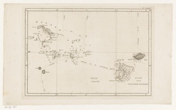
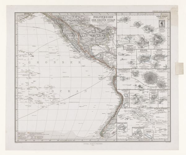
Dimensions: height 370 mm, width 446 mm
Copyright: Rijks Museum: Open Domain
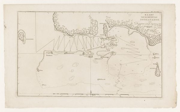
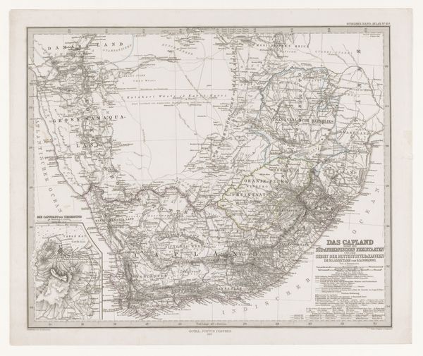
Editor: Here we have "Kaart van West-Polynesië," a print combining etching and engraving, created in 1858 by Carl Poppey. It is quite detailed and covers a vast area; its cool color palette makes me think of old sea voyages. What stands out to you in its visual presentation? Curator: The map intrigues primarily due to its method of construction. The etched lines create a network, meticulously segmenting the depicted space, whilst the engraved details – consider the lettering and the subtle shading used to denote landmass – display an objective contrast, providing legibility. Consider the tension achieved between functionality and aesthetic quality. Does that not impress you? Editor: It does! I appreciate how the lines give a sense of order to what I imagine is an incredibly chaotic, sprawling space. It’s almost like trying to contain the ocean. Curator: Precisely. The use of line, carefully planned, dictates the viewer's journey across the expanse of the map. The eye is directed from one coordinate to another. Note how the gradations of tone provide depth and contrast. Editor: The restrained color palette almost abstracts the landscape. The washes of gray and green differentiate land from sea, yet keep the emphasis on the geometry of the lines. Curator: An astute observation. Do you consider how the engraver employs visual language with economy and refinement, and through that approach constructs a captivating image? Editor: I do now! Before, I was mostly interested in the content. I see the choices Poppey made relating to the engraving’s visuality have such an impact, which shifts the meaning. Curator: Exactly. Studying Poppey’s orchestration of line, tone, and compositional structure unveils deeper complexities. One can observe much with simply focused observation.
Comments
No comments
Be the first to comment and join the conversation on the ultimate creative platform.
More like this