drawing, print, ink, engraving
#
drawing
# print
#
old engraving style
#
landscape
#
ink
#
geometric
#
engraving
#
regionalism
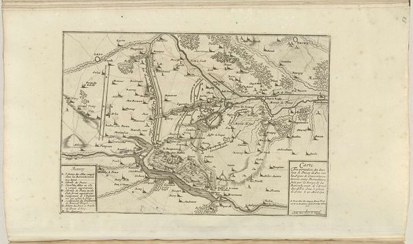
Dimensions: height 220 mm, width 314 mm
Copyright: Rijks Museum: Open Domain
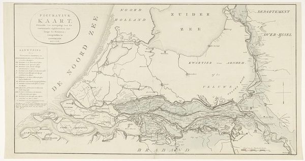
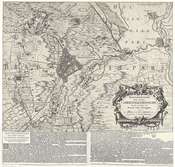
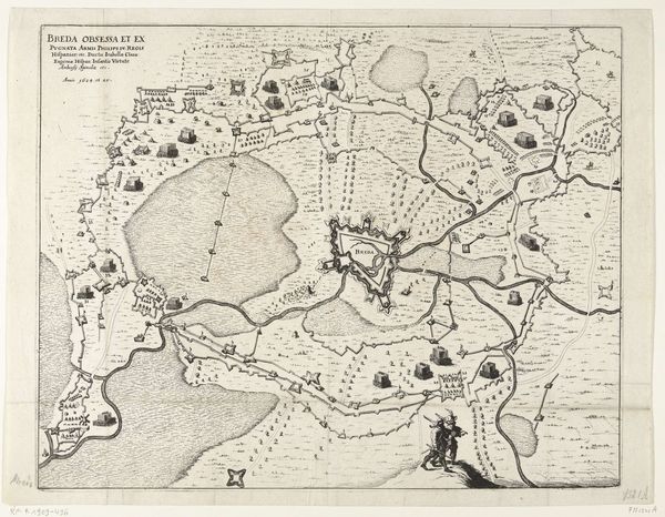
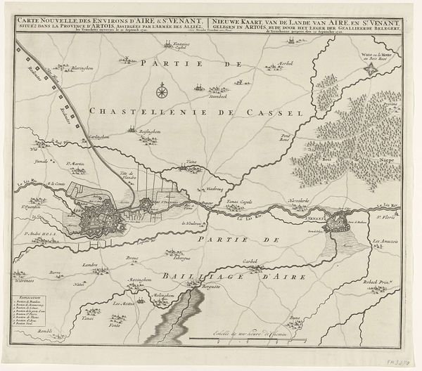
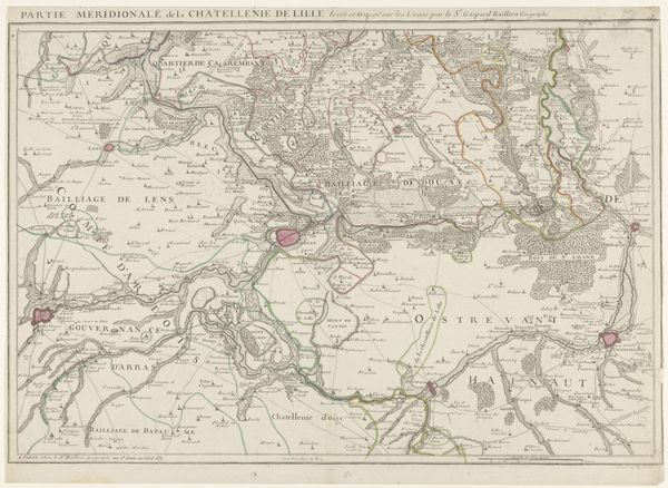
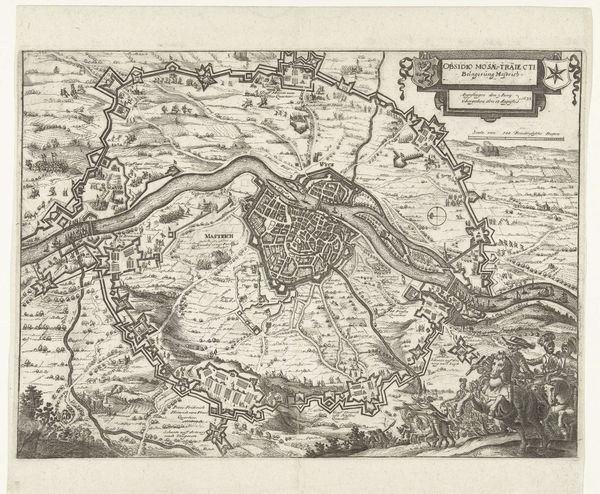
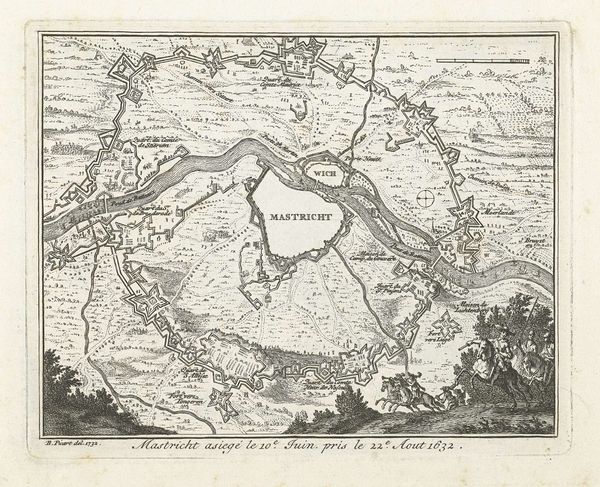
Curator: Here we have Jacobus Turpin's "Kaart van Zeeland en een gedeelte van Vlaanderen en Brabant," dating back to 1785. It is presented as an engraving in ink. Editor: The sheer density of lines initially gives it a very complex, almost overwhelming feeling. It lacks a visual hierarchy beyond the major regional labels, yet its precision is undeniably impressive. Curator: Indeed. Note the remarkable balance and detail in the linework. The stippling delineating water contrasts with the bolder lines defining land. Structurally, it creates a fascinating interplay of positive and negative space. It is quite balanced, given the geographical scope of the piece. Editor: But beyond the formal elements, the map presents a fascinating narrative. As a symbolic object, consider its original purpose. The careful marking of waterways speaks to trade, defense, the very lifeblood of these regions. These geographical features have dictated histories of conflict and community. Curator: Precisely. And how these regions are bordered reveals not only geographic limitations, but conceptual limits imposed upon identity and knowledge, expressed formally in this presentation of edges within the print. Editor: Think of the unseen: the people who navigated these waters, whose lives were determined by these shifting coastlines. Each island and inlet holds echoes of human stories shaped by nature and politics. Even its very construction using the engraving method holds layers of symbolism to reflect the practical skills needed in geographical exploration and conquest during this time period. Curator: The stark contrasts also draw the eye along specific directional lines, implicitly leading you across the areas of the Netherlands depicted. The lines, then, guide not only the eye but conceptual navigation as well. Editor: Examining it more closely like this allows the map's geometric nature to recede somewhat. You realize that it served, at its very core, as a guide—a tangible, representational aid meant to orient people to not just their location but, maybe more profoundly, to their identity and the complex histories layered beneath its relatively minimalist style. Curator: A powerful intersection of form and function, then. It has definitely offered a different lens to look at geographic rendering within this period.
Comments
No comments
Be the first to comment and join the conversation on the ultimate creative platform.
More like this