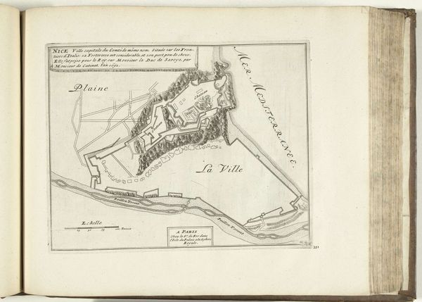
Plattegrond van de abdij van St. Martin bij Trier, ca. 1693-1695 1693 - 1695
0:00
0:00
anonymous
Rijksmuseum
drawing, paper, ink
#
drawing
#
baroque
#
paper
#
ink
#
geometric
#
cityscape
Dimensions: height 217 mm, width 287 mm
Copyright: Rijks Museum: Open Domain
Editor: Here we have an anonymous drawing from around 1693-1695, titled "Plattegrond van de abdij van St. Martin bij Trier," made with ink on paper. It looks like a detailed map, almost like an architect's blueprint of the city. I’m immediately drawn to the intricate linework, it’s really captivating! What elements stand out to you most? Curator: I observe first the dichotomy established by the artist in their formal presentation of the work. One sees immediately how the medium of ink on paper, which is to say the deliberate contrasting tonality of a limited palette, serves the ostensibly cartographic intentions, that are undercut by a florid inscription and geometric forms. Does that decorative, nearly baroque element diminish or amplify its communicative clarity? Editor: That’s a really interesting point. I hadn't considered the potential conflict between decoration and pure information. Is the Baroque aspect purely ornamental, or does it serve another function? Curator: One might propose that it speaks to the aesthetic sensibilities of the time, a layer of courtly grace overlaid on a representation of civic infrastructure. Observe how the lines of the architecture themselves mimic organic shapes; does that tell us something about period aesthetics, a philosophy of place-making, or a theory of representation itself? Editor: I think understanding how visual choices reinforce broader ideas is helpful, even in seemingly straightforward pieces like this. It’s also really changed how I interpret the lines, too, beyond simply utility. Curator: Indeed. Considering the interrelationship of medium and image allows us access to a new understanding of both the intent of the cartographer, and the world it seeks to depict.
Comments
No comments
Be the first to comment and join the conversation on the ultimate creative platform.
More like this