drawing, graphic-art, print, etching, engraving
#
drawing
#
graphic-art
#
dutch-golden-age
# print
#
etching
#
landscape
#
etching
#
engraving
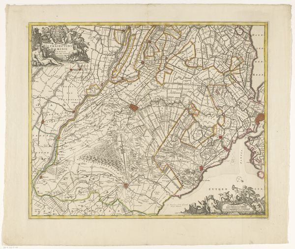
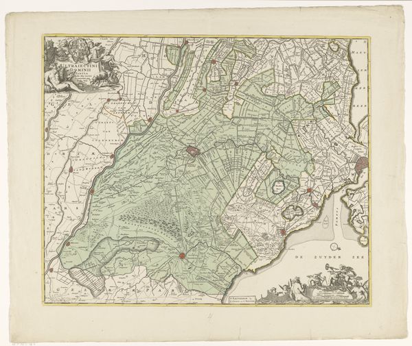
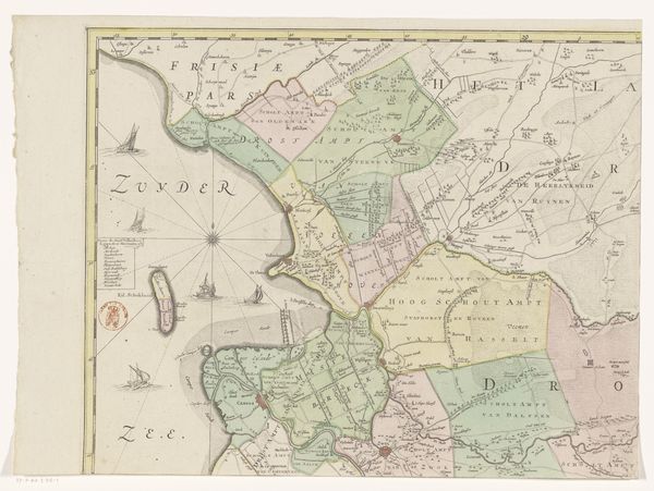
Dimensions: height 474 mm, width 557 mm
Copyright: Rijks Museum: Open Domain
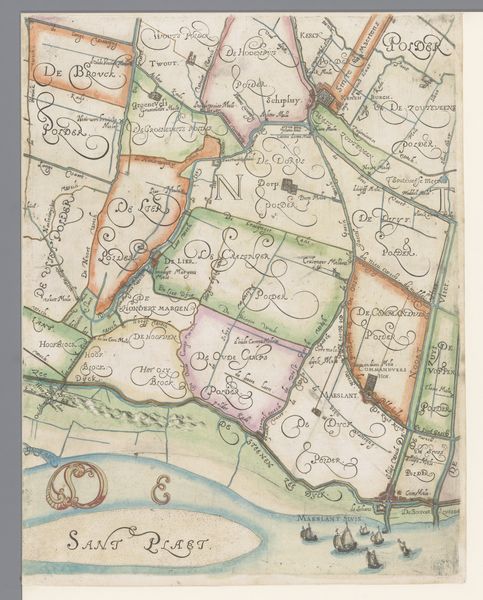
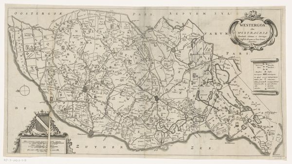
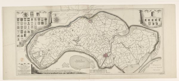
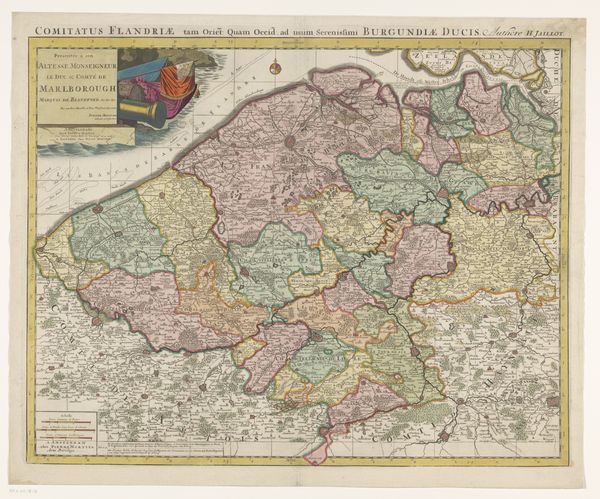
Editor: Here we have an intriguing cartographic print, “Kaart van de provincie Utrecht,” dating between 1655 and 1706. It's an etching and engraving, unsigned, in the collection of the Rijksmuseum. It's really quite striking how geometric the land divisions appear, almost like a Mondrian painting! How do you approach an image like this? Curator: Intriguing observation. First, we can address the intrinsic formal qualities, like the dominance of linear elements, achieved through etching and engraving. Notice the precise rendering of space – a careful interplay between positive and negative forms. What effect does the linear style have, and can we describe this mathematically through line? Editor: Well, I notice how the lines delineate fields, waterways, and property boundaries – almost like a visual language describing ownership and land use. The variation in line weight must be significant? Curator: Precisely. The varying line weights denote a visual hierarchy; Thicker lines demarcate provincial borders while thinner ones suggest minor divisions. Semiotics informs us that even the placement of cartouches in the upper-left communicates power, consider how color usage and iconography work into these structural placements. Where does the composition lead our eyes, and does this path lead anywhere of semiotic value? Editor: I see what you mean, there are also some strong tonal and chromatic changes from lower-left to upper-right. Do these changes communicate about function of use or how the art object wants us to interpret it? Curator: Good questions! Color and tone are deliberately manipulated to direct the observer’s gaze strategically across the province in a considered journey from bottom left to top right. Observe further how this visual path serves an underlying intent for how we engage with power relationships as consumers. Does our attention not naturally return towards symbols within cartouches in upper left that further enhance those dynamics present between land, cartographer, and ruler who profits therein? Editor: So it's not just a map; the artistry in composition and design guide the viewer’s perception. Curator: Yes. Formalism permits us to see that the map isn’t just informative; it also performs ideology encoded through design choices and embedded symbolic structures that operate even on subconscious levels when decoded with art historical context in hand. Editor: That definitely reframes how I view it. Now I see it less as a straightforward representation and more as a carefully constructed argument.
Comments
No comments
Be the first to comment and join the conversation on the ultimate creative platform.
More like this