painting, watercolor
water colours
dutch-golden-age
painting
landscape
watercolor
geometric
watercolor
Dimensions: height 155 mm, width 227 mm
Copyright: Rijks Museum: Open Domain
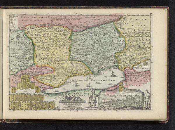
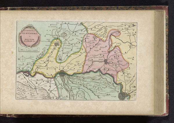
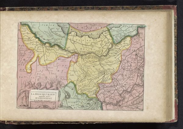
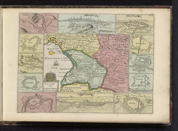
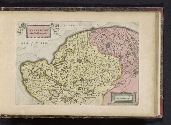
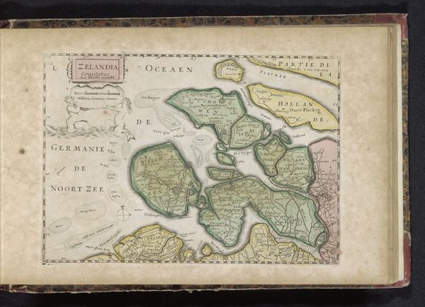
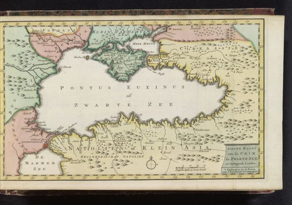
Curator: At first glance, I'm struck by the almost dreamlike quality of this map. It has soft pastel shades that evoke a sense of tranquility and even... nostalgia. Editor: That’s quite a contrast to the reality of 18th-century cartography! What we have here is a watercolor map titled “Kaart van Groningen,” dating roughly from 1700 to 1735, and while attributed to an anonymous maker, its creation undoubtedly involved considerable expertise and perhaps even state interests. Curator: Exactly. A map isn't just a visual guide, it’s a symbolic representation of power, control, and even identity. The gentle colors almost seem to soften the edges of that ambition. Notice how carefully each village and geographical feature is rendered. Editor: The very act of mapping asserts dominion over the land. What I find intriguing is that this watercolor rendering appears to humanize something intrinsically tied to authority and property. Were these intended for a privileged few, or a wider audience to foster local pride? Curator: It suggests perhaps a vision of Groningen as an idealized space—controlled but also harmonious. The way bodies of water and borders gently fade in color also suggests flexibility, potential shifts in power that would require future updates. Editor: The inclusion of surrounding areas offers a political framework of understanding their own domain within the context of neighbors and perhaps rivals. We need to recall this era was one of constant negotiation in response to ever shifting socio-political terrains. It's intriguing how the compass is represented - more than an object to show directions, its geometric presentation feels to function as a philosophical orientation. Curator: It all feeds into the psychological reassurance such a map provides. We see our place in the world, rendered comprehensible and ordered, with boundaries even represented through aesthetic choices as much as through concrete markers. A world that is at once controlled and beautiful. Editor: Indeed. Looking at the precise watercoloring, it is a fine historical document to understanding Dutch Golden Age mapping from a local administrative perspective. Its value is not merely utilitarian - the map's creation represents Groningen’s relationship to their environment, to each other, and of course, to their sense of self. Curator: I see now how those seemingly gentle colours mask more significant claims. A quiet statement of belonging, rendered for the ages.
Comments
No comments
Be the first to comment and join the conversation on the ultimate creative platform.