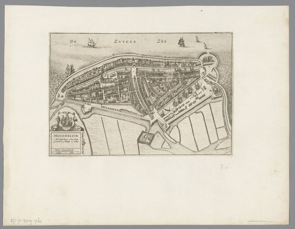
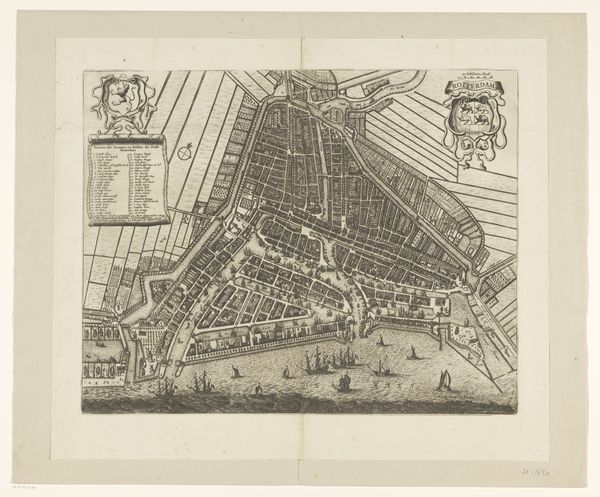
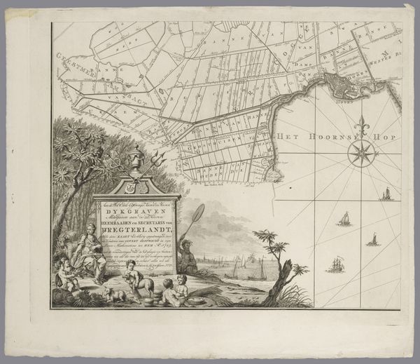
Plattegrond van de stad en de omgeving van Mantua (deel rechtsboven) 1704 - 1724
anonymous
Rijksmuseum
drawing, print, ink, engraving
drawing
baroque
old engraving style
ink
geometric
cityscape
history-painting
academic-art
engraving
Dimensions: height 279 mm, width 337 mm
Copyright: Rijks Museum: Open Domain
Curator: Here we have a print from the Rijksmuseum’s collection: a section of a city plan depicting Mantua and its surroundings. It’s an engraving created between 1704 and 1724 by an anonymous artist, using ink on paper. Editor: It's incredibly detailed, isn’t it? All those tiny lines create such a crisp, clear image. The precision suggests both scientific accuracy and perhaps a little...dare I say, a yearning for control over the depicted territory? Curator: I find it compelling how the map utilizes both symbolic representation and accurate detail. Take, for instance, the dominating eagle atop the cartouche naming the city as relevant to the King of Prussia. This serves a dual purpose: cartographic documentation but also a declaration of power and patronage. Editor: Exactly! That cartouche is brilliant! Notice the interplay of the flowing ribbons with the rigid geometry of the map itself. It’s like a visual tension between the idealized image and the lived reality of the city it depicts. Semiotics aside, though, it strikes me as quite…orderly. Predictable. Curator: In many ways, that sense of order is what a city map offers—a sense of control over a landscape, translating geographical space into something legible and navigable. Consider, too, that this map not only served practical purposes, guiding travelers and soldiers perhaps, but it also conveyed a specific vision of Mantua at a time of geopolitical flux. The waterways aren't just navigational aids, but lifelines and defensive moats that feed a vibrant center. Editor: And speaking of defense, those fortifications…angular and sharply delineated against the softer curves of the land. Visually, that tension highlights the artificial constructs humans impose on nature, how they strive to defend it all. Curator: I agree, and I believe these cartographic renderings contribute to an important part of collective cultural memory, recalling for us not only what was there but how that city mattered at that specific moment in time. Editor: Fascinating. It’s funny how a seemingly objective representation like this can be so rich in…visual storytelling, I guess. Even the choice of medium, the fine lines of engraving, imparts a sense of formality, precision, even authority to the image. Curator: Yes, an artistic interpretation through that scientific lens—a Baroque sensibility shaping geographic information into powerful cultural document.
Comments
No comments
Be the first to comment and join the conversation on the ultimate creative platform.