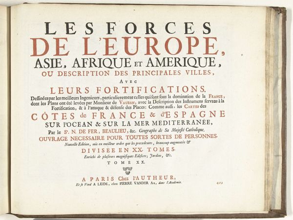
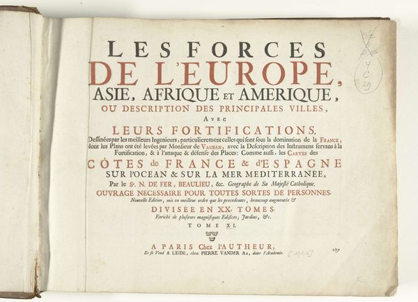
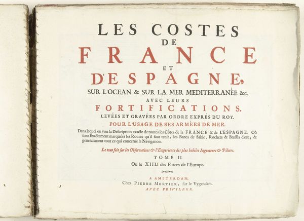
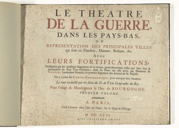
Titelpagina voor het prentwerk: Les Forces de l'Europe, Asie, Afrique et Amerique (...) Comme aussi les Cartes des Côtes de France et d'Espagne (deel XV), 1726 1726
0:00
0:00
pietervanderiaa
Rijksmuseum
print, typography, engraving
#
baroque
# print
#
typography
#
engraving
Dimensions: height 300 mm, width 390 mm
Copyright: Rijks Museum: Open Domain
Curator: This piece is a title page from 1726, for the work *Les Forces de l'Europe, Asie, Afrique et Amerique,* or *The Forces of Europe, Asia, Africa, and America*, by Pieter van der Aa. It's a print using both typography and engraving and currently resides in the Rijksmuseum. Editor: My first impression is that it seems deceptively simple. Just text on a page, but the variations in font and size suggest a hierarchy of information, almost a visual map in themselves. There's an inherent drama here. Curator: I agree. There is more than what it seems. It evokes a sense of cultural memory around cartography and the scientific fervor that came with exploring what Europeans deemed to be newly discovered worlds. Think of the psychology, the very idea of control. This piece reflects European ambitions on a grand scale. Editor: Exactly. It almost feels like a propaganda piece cloaked as geographical information. Look how it elevates France within the context. The phrase mentioning fortifications "sous la domination de la France" clearly underscores power. It's a bold visual statement about geopolitical force using the guise of typography. Curator: It reveals a kind of performance through typography, presenting itself as factual while inherently imbued with ideological intent. This layering connects to earlier symbolic expressions; emblems used to represent cultural values and power. Editor: It is an overture to a much grander, meticulously rendered theatrical stage set through the strategic placement of letters and the stark contrast of black ink on the off-white page. It feels quite Baroque, actually. The balance and the elaborate detail hint to that artistic movement. Curator: It’s like the page itself becomes a symbolic landscape, a theater presenting Europe and other continents not just geographically, but as components within the grand drama of global power dynamics. Editor: I hadn't thought about the theatrical staging quite that way. It pulls together form, context, and symbolism rather beautifully. Curator: It's quite intriguing to consider what this meant to audiences at that time— and how we can still draw layers of symbolic significance out of it today.
Comments
No comments
Be the first to comment and join the conversation on the ultimate creative platform.
More like this