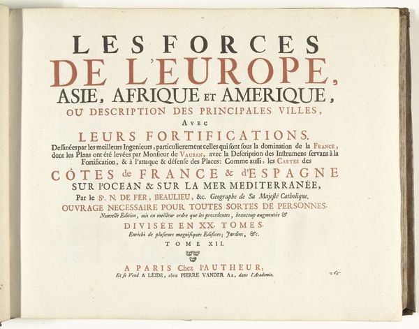
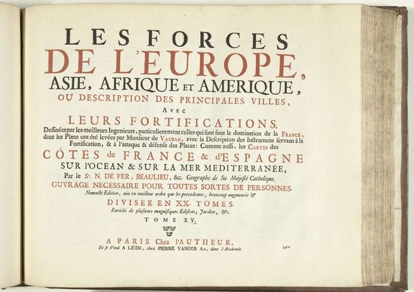
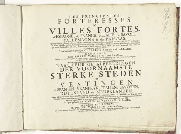
Titelpagina voor het prentwerk: Les Forces de l'Europe, Asie, Afrique et Amerique (...) Comme aussi les Cartes des Côtes de France et d'Espagne (deel X), 1726 1726
0:00
0:00
pietervanderiaa
Rijksmuseum
print, paper, typography, engraving
#
baroque
# print
#
paper
#
typography
#
engraving
#
watercolor
#
historical font
Dimensions: height 300 mm, width 390 mm
Copyright: Rijks Museum: Open Domain
Editor: Here we have the title page from "Les Forces de l'Europe, Asie, Afrique et Amerique…," a print by Pieter van der Aa from 1726. Looking at this Baroque typography, I can't help but wonder, what did this kind of bold claim of power –the Forces of Europe, Asia, Africa, and America– actually represent? Curator: That's a fantastic starting point. The title itself points to a moment of intense geopolitical maneuvering and European ambition. How does understanding colonialism impact your interpretation? Editor: Well, seeing it through a postcolonial lens definitely changes things. The "forces" aren't just about military might, but also about the assertion of dominance over entire continents, right? What was the relationship between cartography and colonization during this time? Curator: Precisely. Cartography wasn't just about mapping; it was about claiming and legitimizing control. Note the detail promising descriptions of fortifications; this wasn’t just for academic interest but a practical tool of empire. This print, then, participates in constructing a European-centric worldview. It uses the power of print to disseminate not only geographic information, but a carefully curated narrative of global power dynamics. How does that added dimension resonate with you? Editor: It's unsettling to think about how this image played a part in that narrative, making it seem almost like a commercial transaction, a literal packaging of power. It really shifts my perspective on the piece. I initially saw interesting typography; now, I'm considering the power structures it represents. Curator: And that's exactly the point, isn’t it? We move beyond just aesthetic appreciation to actively questioning the intentions, the audiences, and the wider historical and political forces that shaped its creation and reception.
Comments
No comments
Be the first to comment and join the conversation on the ultimate creative platform.
More like this