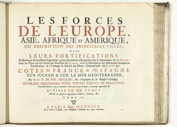
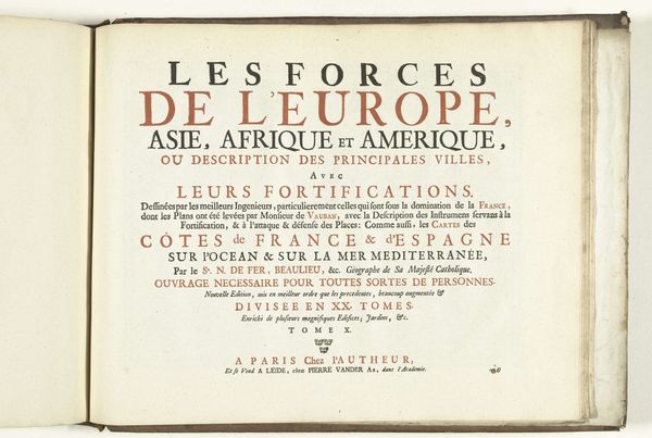
Titelpagina voor het tiende deel van het prentwerk: Les Forces de l'Europe, Asie, Afrique et Amerique, ca. 1702 1702 - 1703
0:00
0:00
pieterimortier
Rijksmuseum
print, typography, engraving
#
aged paper
#
baroque
#
parchment
# print
#
hand drawn type
#
tea stained
#
typography
#
stylized text
#
thick font
#
warm-toned
#
cityscape
#
handwritten font
#
golden font
#
engraving
#
historical font
Dimensions: height 320 mm, width 410 mm
Copyright: Rijks Museum: Open Domain
This is the title page for the tenth volume of "Les Forces de l'Europe, Asie, Afrique et Amerique" made around 1702 by Pieter Mortier I. The artwork is dominated by text arranged in a clear hierarchy. The title is split across three lines in alternating black and red ink to draw the eye, followed by descriptions in smaller font sizes. This layout emphasizes the book's subject matter: the forces and fortifications of cities across four continents. The strategic use of typography and color directs the viewer's gaze. The choice of a serif typeface conveys a sense of formality aligning the book with the values of the era. The title page functions not merely as an introduction but as a structured visual field. Consider how this organized presentation reflects the period’s broader intellectual and cultural preoccupations, where even something as simple as a title page becomes a site of carefully constructed meaning.
Comments
No comments
Be the first to comment and join the conversation on the ultimate creative platform.
More like this