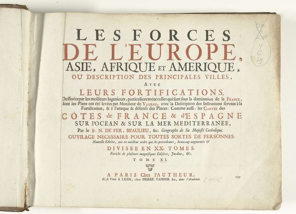
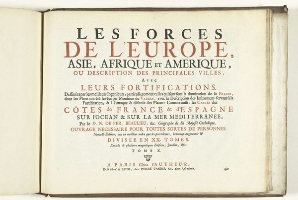
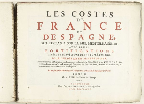
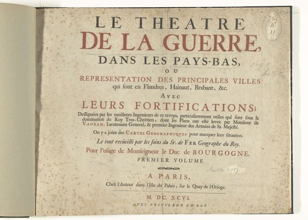
Titelpagina voor het prentwerk: Les Forces de l'Europe, Asie, Afrique et Amerique (...) Comme aussi les Cartes des Côtes de France et d'Espagne (deel XII), 1726 1726
0:00
0:00
pietervanderiaa
Rijksmuseum
print, typography, engraving
#
aged paper
#
hand-lettering
#
baroque
# print
#
hand drawn type
#
text
#
typography
#
hand-drawn typeface
#
fading type
#
stylized text
#
thick font
#
handwritten font
#
golden font
#
engraving
#
historical font
Dimensions: height 300 mm, width 390 mm
Copyright: Rijks Museum: Open Domain
Curator: Before us, we have the title page to "Les Forces de l'Europe, Asie, Afrique et Amerique," which translates to "The Forces of Europe, Asia, Africa and America." Published in 1726, this print by Pieter van der Aa (I) is part of the Rijksmuseum's collection. It's an engraving, showcasing the intricate typography typical of the baroque period. Editor: My first thought is "map fever dream!" I love the density, how every available space is packed with meticulously crafted letters. It gives me a slightly anxious but exhilarating feeling, like standing on the edge of history, looking into the swirling winds of discovery. Curator: Absolutely, that's the baroque aesthetic—filling every space to convey grandeur and knowledge. The title gives us a glimpse into the era's ambition to encompass the known world through cartography. Notice how the continents are presented almost as equal players on a stage, suggesting an interconnectedness that's both geographical and political. Editor: Equal on a stage maybe, but equal in the eyes of the French? The fine print, dedicating these fortifications to the dominion of France by Monsieur de Vauban, feels like a not-so-subtle power move. Underneath that beautiful type lies a strategic agenda. Curator: Precisely. This wasn’t just about mapping the world; it was about mapping power and influence. The title promises a global view, but the detailed descriptions focus heavily on the French and Spanish coastlines, highlighting their strategic importance at the time. The hand-drawn typefaces also adds a layer of artistry, a touch of the human hand in what was becoming a world increasingly defined by precise scientific observation. Editor: It’s beautiful propaganda, then. Imagine encountering this in a bookstore in 1726—all those dramatic capital letters, promising enlightenment and strategic advantage in one fell swoop! I see it almost as performance piece from way back when. A display of early globalization. Curator: It's fascinating to consider how design and political messaging worked in tandem, long before the digital age. Examining pieces like this remind us how powerfully visual information shapes perceptions, even today. Editor: It’s amazing that something so visually compelling on the surface could contain so much historical tension. I now leave with the awareness of our power to shape perspective with even the choice of fonts!
Comments
No comments
Be the first to comment and join the conversation on the ultimate creative platform.
More like this