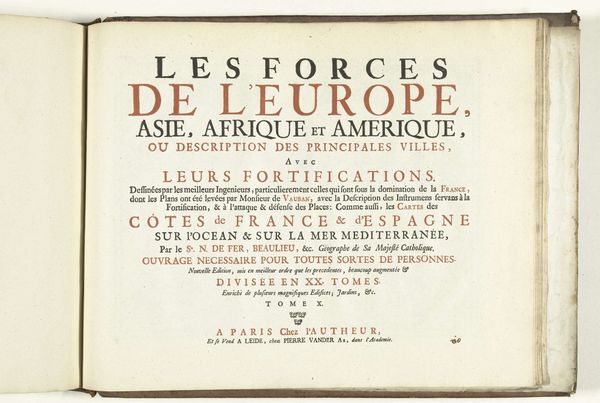
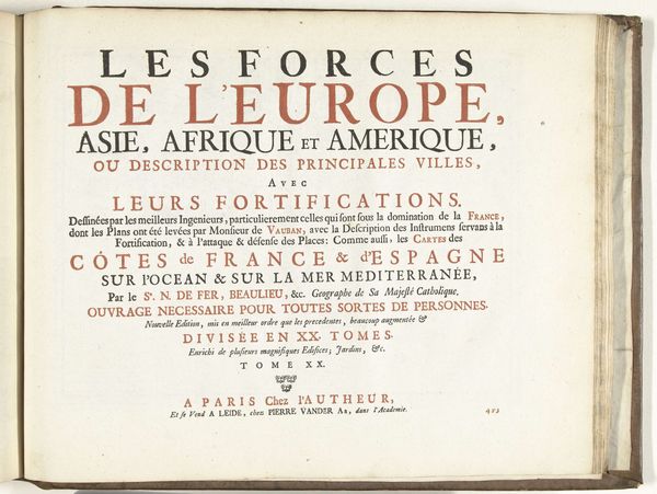
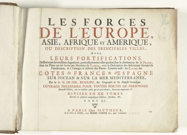
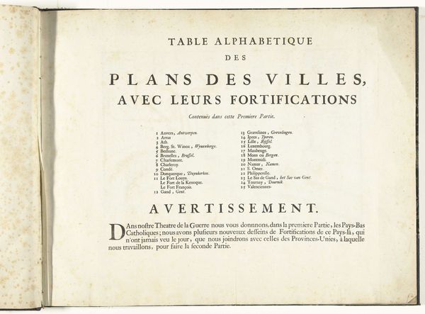
Titelpagina voor het tweede deel van het prentwerk: Les costes de France et d'Espagne, ca. 1702 1702 - 1703
0:00
0:00
pieterimortier
Rijksmuseum
graphic-art, print, typography, engraving
#
graphic-art
#
aged paper
#
hand-lettering
#
baroque
# print
#
hand drawn type
#
typography
#
hand-drawn typeface
#
fading type
#
stylized text
#
thick font
#
history-painting
#
handwritten font
#
golden font
#
engraving
#
historical font
Dimensions: height 320 mm, width 410 mm
Copyright: Rijks Museum: Open Domain
This is the title page for the second volume of "The Coasts of France and Spain," a print made around 1702 by Pieter Mortier in Amsterdam. The letters, bold and declarative, announce the volume's contents, a detailed charting of coastlines and fortifications. Look closer: the meticulous descriptions promised here are not merely geographical; they are strategic, intended "for the use of His Majesty’s naval forces." Maps, throughout time, have always held a dual purpose, haven’t they? As tools for navigation but also as instruments of power. Think of Ptolemy's "Geography," rediscovered in the Renaissance, or even the modern-day Peters projection, each reflecting a specific worldview. The act of mapping—of defining boundaries—is itself a psychological act. It betrays a need to control, to understand, to impose order on the unknown. As we gaze at this title page, we confront not just a description of land, but a projection of human will onto the world. This print reminds us that every map is a statement of intent, etched with the desires and fears of its creators.
Comments
No comments
Be the first to comment and join the conversation on the ultimate creative platform.
More like this