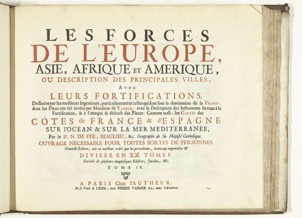
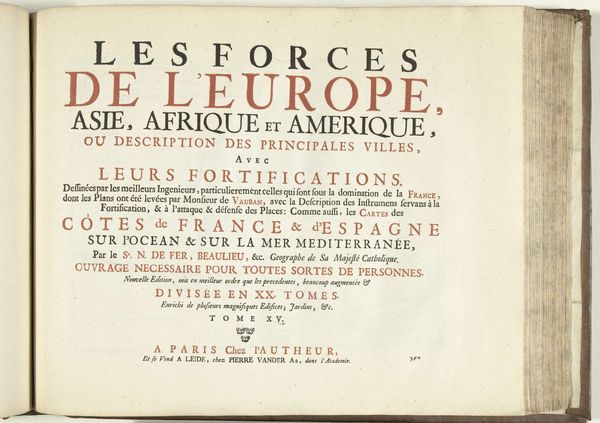
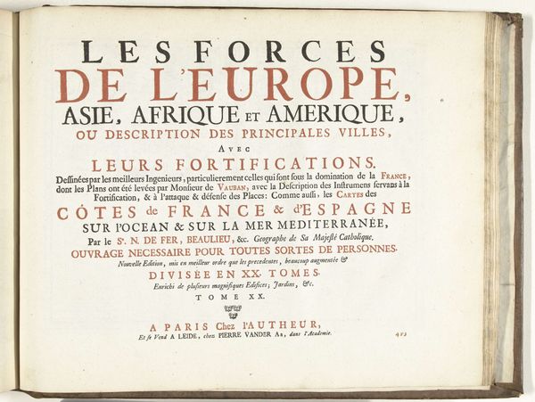
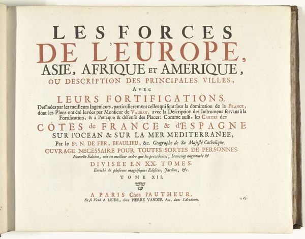
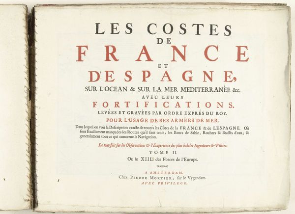
Titelpagina het zesde deel van het prentwerk: Nicolas de Fer, Les forces de l'Europe, 1696 1696
0:00
0:00
nicolasdefer
Rijksmuseum
print, engraving
#
baroque
# print
#
history-painting
#
engraving
#
watercolor
#
historical font
Dimensions: height 290 mm, width 360 mm
Copyright: Rijks Museum: Open Domain
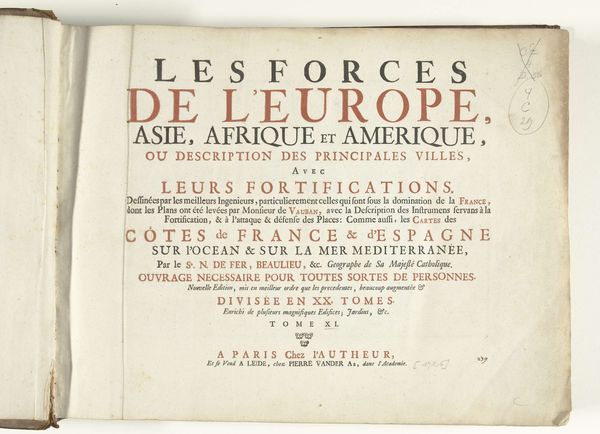
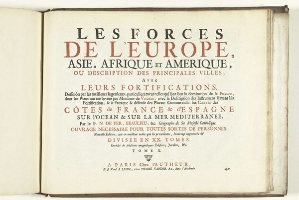
This is the title page of the sixth part of Nicolas de Fer’s “Les forces de l’Europe,” printed in 1696. The page presents a study in typographic hierarchy and spatial organization. Notice how De Fer employs varying font sizes and weights to structure the viewer’s reading experience. The title, emblazoned in large, bold fonts, immediately captures attention, while subsequent lines decrease in size to guide the reader through layers of detail and context. The use of red ink for selective emphasis creates a visual rhythm that underscores key phrases. The structural clarity on display is more than aesthetic. It reflects a broader intellectual framework of the period, where the systematic classification and ordering of information were highly valued. De Fer presents not just a title, but a meticulously structured index to the contents within, encapsulating the spirit of the era’s cartographic and political ambitions. The layout of the printed word offers a lens through which to view the complexities of European power.
Comments
No comments
Be the first to comment and join the conversation on the ultimate creative platform.
More like this