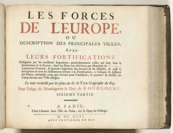
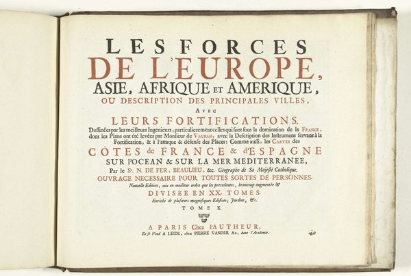
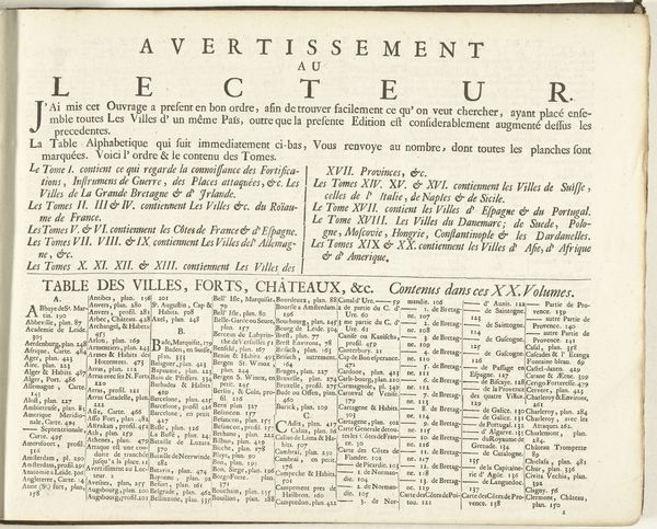
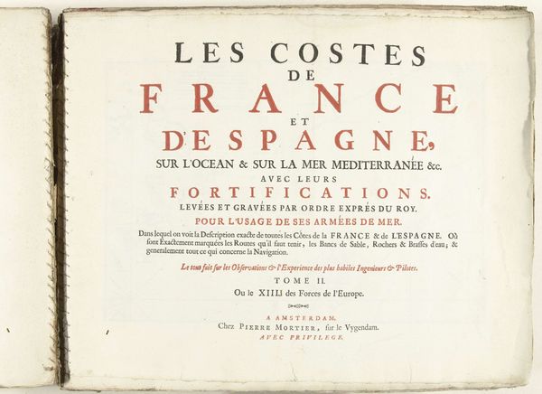
Titelpagina voor het eerst deel van het prentwerk: Le Theatre de la Guerre, dans les Pays-Bas, 1696 1696
0:00
0:00
nicolasdefer
Rijksmuseum
graphic-art, print, typography, engraving
#
graphic-art
#
aged paper
#
homemade paper
#
baroque
#
parchment
# print
#
tea stained
#
typography
#
fading type
#
stylized text
#
thick font
#
cityscape
#
history-painting
#
handwritten font
#
golden font
#
engraving
#
historical font
Dimensions: height 305 mm, width 390 mm
Copyright: Rijks Museum: Open Domain
Editor: Here we have the title page to the first volume of "Le Theatre de la Guerre, dans les Pays-Bas," created in 1696 by Nicolas de Fer. It's a printed piece, seemingly an engraving. The aged paper gives it such a unique aura of history, doesn’t it? What captures your attention most about this piece? Curator: Oh, the scent of old paper and grand ambition practically wafts off it, doesn't it? Beyond the gorgeous typography – those baroque flourishes! – I see a world obsessed with order and power. Notice how the title itself frames war as a spectacle, a “theatre.” It’s not just about conflict, but representation. What kind of representation, I wonder? Is it accurate or aspirational? Editor: Hmmm, "spectacle" is interesting. I guess that implies a certain... performance of power? The cities are being displayed almost like actors on a stage, to be admired or perhaps feared. Curator: Exactly! And that's underscored by the phrase "avec privilege du Roy," boldly claiming royal endorsement. This wasn’t just geography, it was propaganda, a carefully constructed image of Louis XIV’s power projected onto the Netherlands. The focus on fortifications, planned by the best engineers of the time, gives us an impression that precision and technological advantage defined warfare. But did they, really? What were the human costs hidden behind this 'scientific' façade? Editor: That's so interesting; I didn't immediately think about the propagandistic aspects. Seeing the mapmaking as a power display gives it a totally different context. I always just thought of these prints as… well, pretty! Curator: Pretty, yes, but also powerful tools. Now, whenever you look at old maps, ask yourself: Whose story is it telling, and what is it trying to achieve? Thinking critically changes the entire way you see it, doesn’t it? Editor: It certainly does! I’ll definitely carry that thought forward. Thanks for unraveling the deeper story within this seemingly simple title page!
Comments
No comments
Be the first to comment and join the conversation on the ultimate creative platform.
More like this