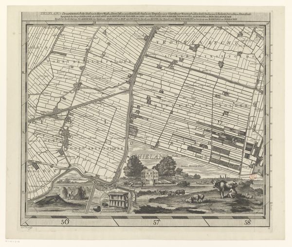
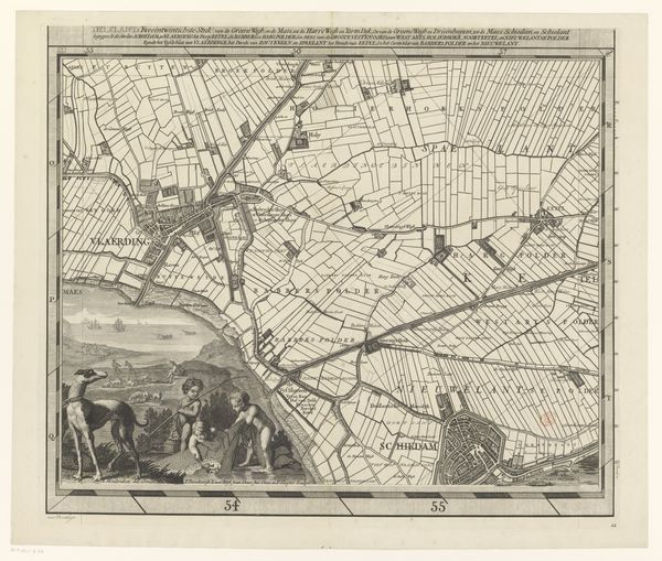
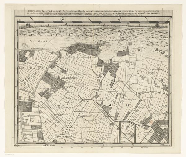
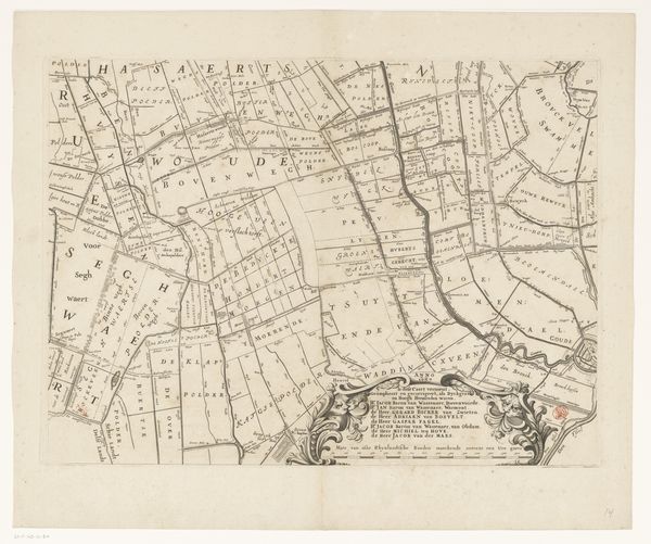
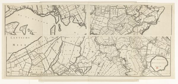
Kaart van het Hoogheemraadschap van Delfland (vierentwintigste deel) 1712 - 1735
print, engraving
baroque
dutch-golden-age
landscape
geometric
engraving
Dimensions: height 514 mm, width 592 mm
Copyright: Rijks Museum: Open Domain
Editor: Here we have a print titled "Kaart van het Hoogheemraadschap van Delfland (vierentwintigste deel)" by Luggert van Anse, created sometime between 1712 and 1735. It's an engraved map, and what strikes me is the rigid geometric layout juxtaposed with the more playful allegorical scene at the bottom. What is your interpretation of how these elements work together formally? Curator: Indeed, the contrast is quite pronounced. Looking at the upper portion, one sees a meticulously constructed grid, its lines sharp and unwavering. The precise engraving technique reinforces this sense of order, of human control imposed upon the land. This recalls the broader aesthetic project of the period, doesn't it? Thinkers were enamored by geometrical solutions that embodied the supposed harmony of the cosmos. Editor: I hadn't considered it quite like that. What about the imagery at the bottom? Does that disrupt this ordered space? Curator: The scene below injects a dynamism that the grid lacks. These figures, rendered with a softer touch, introduce a narrative element, evoking a sense of the land's bounty and the human connection to it. Consider the varying textures – the rough engraving suggesting fabrics against smooth skin. Does it integrate the two? I believe they co-exist as separate spaces. The main idea is the map itself and the geometry imposed on nature is offset against cherubic bodies and fertile harvests that do not break, but reinforce this mapping enterprise. Editor: So the rigid lines and forms emphasize a planned approach to the land itself? Curator: Precisely. This formal arrangement mirrors an ambition to dominate nature. Editor: This has broadened my understanding of how geometric composition and stylistic elements function! Thanks for sharing this perspective. Curator: And thank you for bringing fresh eyes to the formal tension in the print. It enriches our appreciation, I hope, and leads to better art historical engagement.
Comments
No comments
Be the first to comment and join the conversation on the ultimate creative platform.