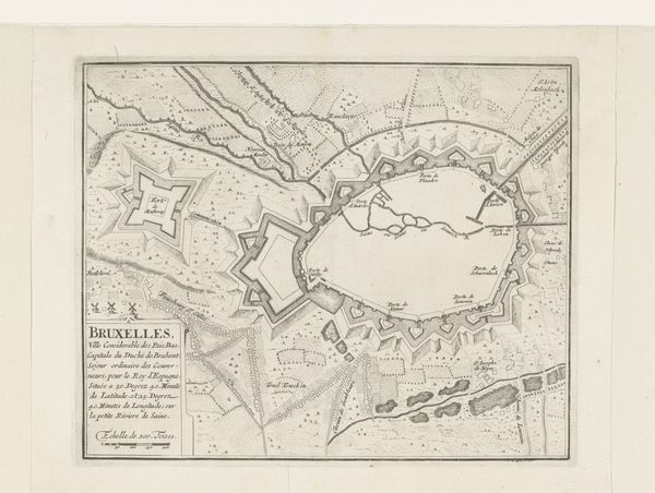
drawing, paper, ink
#
drawing
#
baroque
#
paper
#
ink
#
cityscape
#
history-painting
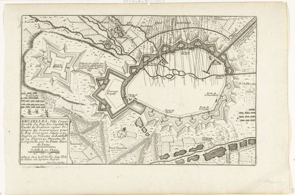
Dimensions: height 194 mm, width 301 mm
Copyright: Rijks Museum: Open Domain
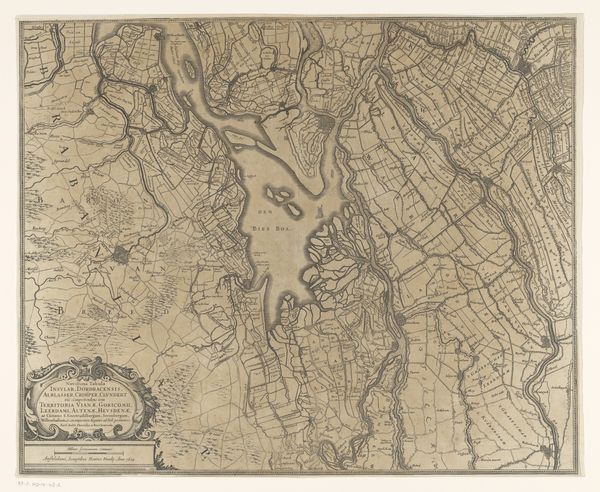
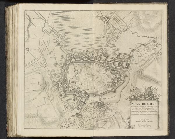
Editor: Here we have "Map of Brussels with fortifications," an ink drawing on paper from around 1690, by H. van Loon. It’s fascinating, almost looks like a celestial plan with all the radiating lines. What strikes you most about this piece? Curator: For me, it’s the vulnerability masked as power. Look at the baroque fortifications, these star-shaped fortresses painstakingly rendered. It suggests a need for control, a fear of being encroached upon. But the fragile paper, the delicate lines… they hint at the impermanence of such defenses, don't you think? Editor: I hadn’t considered the material fragility in contrast to the strength implied by the city's defenses. Is that a typical theme for cityscapes from this era? Curator: Oh, absolutely! It’s a dance between ambition and anxiety. This wasn’t just about mapping a location; it was about projecting power, solidifying identity in a volatile world. Think about how much the lines of ink are so meticulously planned and executed in comparison to the real world that I am sure was hectic and sprawling. A touch melancholic too, perhaps, don’t you think? The artist has captured more than city infrastructure on paper. Editor: Yes, there's something melancholic. Like a carefully constructed sandcastle awaiting the tide. Thank you for pointing that out, I wouldn't have seen it that way at first! Curator: The joy of art! It reflects back at us what we bring to it, illuminating both the subject and ourselves.
Comments
No comments
Be the first to comment and join the conversation on the ultimate creative platform.
More like this