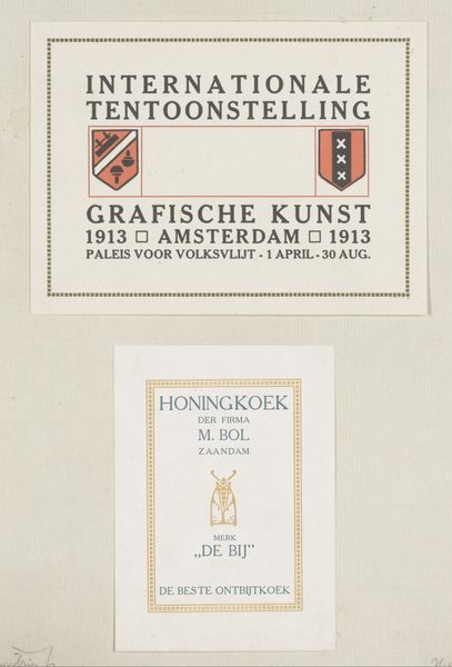
Advertenties voor de internationale tentoonstelling van Grafische Kunst te Amsterdam en logement Het Wapen van Amsterdam 1913 - 1952
0:00
0:00
Dimensions: height 340 mm, width 250 mm
Copyright: Rijks Museum: Open Domain
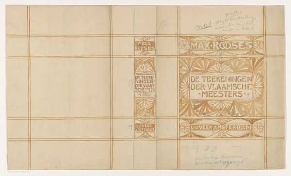
Editor: So, here we have Reinier Willem Petrus de Vries's combined posters, "Advertenties voor de internationale tentoonstelling van Grafische Kunst te Amsterdam en logement Het Wapen van Amsterdam," created sometime between 1913 and 1952. The typography really stands out to me – it's so clean and organized. What visual elements draw your attention most? Curator: The graphic quality interests me; notice how de Vries reduces forms to their essence. Observe the strategic use of rectangles and heraldic shapes, segmented by a restricted palette. It flattens the image, emphasizing the materiality of the poster as an object. Do you notice how the use of repeated motifs across the two panels creates a unified composition despite them advertising different subjects? Editor: Yes, the color scheme is simple but it really unifies the top and bottom sections. Also, the heraldic symbols almost feel like corporate logos. Is there something specific about the placement of the typography you find compelling? Curator: Indeed. Note how the text is integrated with the images rather than merely labeling them. Consider the careful distribution of positive and negative space around the text; each letter contributes to the overall composition, creating a balance between form and content. The use of line and geometric patterns serves as more than decoration. Editor: That’s interesting, how the integration and form play out together, instead of just being informational. So looking at it through this lens, I appreciate the conscious use of geometry to promote not only art, but the lodging too. I suppose every element truly has a purpose in its visual language. Curator: Precisely, and it speaks to the fundamental properties of this form of graphic design.
Comments
No comments
Be the first to comment and join the conversation on the ultimate creative platform.
More like this