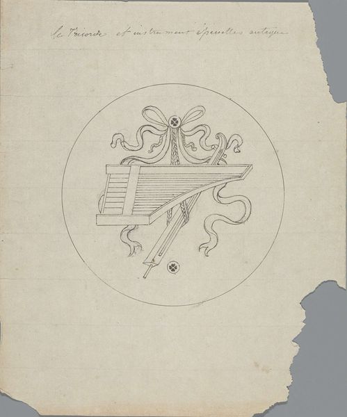
Reclamekaart voor Atelier voor Versieringskunst Mimosa after 1910
0:00
0:00
graphic-art, typography, poster
#
graphic-art
#
art-nouveau
#
typography
#
watercolour illustration
#
decorative-art
#
poster
#
watercolor
Dimensions: height 103 mm, width 135 mm, width 270 mm
Copyright: Rijks Museum: Open Domain
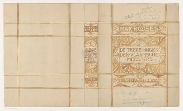
Curator: This poster, titled "Reclamekaart voor Atelier voor Versieringskunst Mimosa," translating to "Advertising card for the Mimosa Decorative Arts Studio," was created sometime after 1910 by Reinier Willem Petrus de Vries. It showcases graphic art and typography typical of the Art Nouveau period. Editor: My first impression is one of restrained elegance. The color palette is muted, and the composition feels very balanced and clean, a kind of decorative utilitarianism. Curator: Utilitarianism is an interesting way to put it! These kinds of advertising cards were definitely tools of commerce, yet the choice of Mimosa as the studio name conjures up associations with nature, delicate beauty and even, potentially, fleeting joy, given the flower's brief blooming season. Editor: Yes, it suggests a kind of aspiration towards accessible beauty, doesn't it? Art Nouveau was all about making art part of everyday life, blurring the boundaries between art and design. The typography, that stylized font used for the address – it's functional yet elegant, embodying that very idea. How do you think its specific design would attract potential customers? Curator: The typography is particularly striking, harmonising perfectly with the curvilinear lines in the emblem above and the ornamentation flanking the address, lending to an impression of carefully curated elegance. It might have signaled refinement and modernity to the intended bourgeois clientele in Hilversum. Perhaps, promising not just artistry, but also taste. Editor: And of course, these cards served to shape the very perception of 'taste,' contributing to the institutionalization of Art Nouveau aesthetics. Think of the Arts and Crafts movement; there's a clear lineage of democratizing design through commerce and art education. Curator: Absolutely. The emblem, that simplified Mimosa blossom within the circle—almost a symbolic echo— hints at the deeper psychological draw: the allure of the natural world, simplified and stylishized, presented for one's immediate possession. Editor: It does show how commercial art was a site of both artistic expression and social construction. Not just advertisements, but vehicles shaping aesthetic ideals within a specific cultural moment. Curator: It gives us much to think about, revealing how commerce and aesthetics combine, leaving its quiet, understated mark on our perception. Editor: Precisely. Each element reflects both its intended audience and its enduring presence in cultural history, raising questions about artistic commercial identity that continue today.
Comments
No comments
Be the first to comment and join the conversation on the ultimate creative platform.
More like this