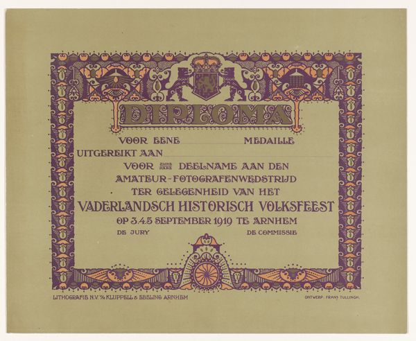
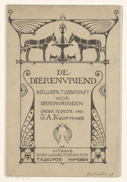
Getuigschrift van de kookcursus bij de Philips Huishoudschool 1916
theonieuwenhuis
Rijksmuseum
drawing, graphic-art, ink, pen
drawing
graphic-art
art-nouveau
pen drawing
pen illustration
ink
pen-ink sketch
pen work
pen
decorative-art
Dimensions: height 195 mm, width 260 mm, height 227 mm, width 300 mm
Copyright: Rijks Museum: Open Domain
Curator: Welcome. Today, we're looking at "Getuigschrift van de kookcursus bij de Philips Huishoudschool," a certificate of cooking course completion from the Philips Household School, created around 1916 by Theo Nieuwenhuis. It's currently held at the Rijksmuseum. It seems to be a pen and ink drawing. Editor: Well, it's quite lovely! There's something charmingly anachronistic about a certificate being such an artful creation. The detailed borders, the swirling lines… it feels a bit like a fancy Victorian valentine, but for cooking class. It is kind of delightful, though, isn't it? Curator: Indeed. The Art Nouveau style, prevalent at the time, elevates what might otherwise be a mundane document. The Philips company was, of course, making lightbulbs, and was deeply embedded within Eindhoven. What's interesting is how the certificate positions them not only as an industrial force, but as shaping domestic life and leisure of female workers. Editor: You know, I love that the borders are filled with images of home. The cosy kitchens and a vase with a bouquet: such comforting elements. It feels like this certificate wasn't just a confirmation of a skill, but an acknowledgement of someone's progress in cultivating their little world. You even get the Philip lightbulb subtly worked in! Curator: Absolutely, there's a clear agenda here. This wasn't simply about providing skills; it was about instilling certain ideals of domesticity among their employees, primarily women of the factory floor who were trained to become housewives in the school. This is a decorative object that promotes industrial-based corporate control of local households through culinary guidance and training. Editor: Ah, you're bringing me back to earth now... and of course, a business isn't a charity... And that is where the drawing’s beauty begins to become a tool for managing power! Curator: Precisely. And it speaks to the fascinating intersections of art, industry, and social engineering in the early 20th century. Editor: Well, even knowing its deeper implications, there's still something inherently beautiful about this drawing. Food has power, doesn’t it? The lovely symmetry and composition remain for all. Curator: A complex piece with multiple stories, beautifully rendered. Editor: A tasty thought to end on! Thank you.
Comments
No comments
Be the first to comment and join the conversation on the ultimate creative platform.