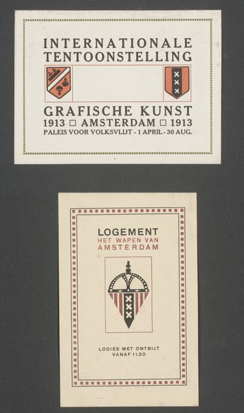
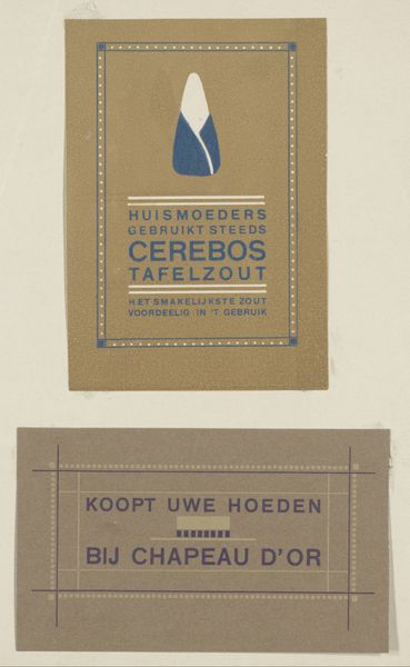
Advertenties voor de internationale tentoonstelling van Grafische Kunst te Amsterdam en honingkoek van de firma M. Bol 1913 - 1952
0:00
0:00
Dimensions: height 102 mm, width 138 mm, height 107 mm, width 77 mm
Copyright: Rijks Museum: Open Domain
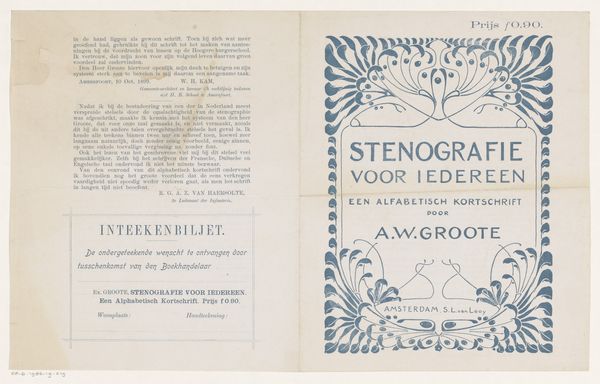
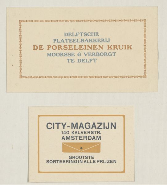
This is a print, made in 1913 by Reinier Willem Petrus de Vries to advertise an international exhibition of graphic art, and, a company selling honey cakes. What I find so interesting about this piece is the flatness of the image, and the limited colour palette. The piece is predominantly monochrome with very limited use of red and gold. This colour palette really highlights the material quality of the print. The process of creating a print is a very physical one, it requires the artist to really feel the block and the surface of the paper as they print. I like how this print seems to reflect an interest in commercialism and fine art, something artists like Andy Warhol went on to explore later in the twentieth century. To me, this piece is about how art is an ongoing conversation that explores our constantly shifting relationship to the world around us.
Comments
No comments
Be the first to comment and join the conversation on the ultimate creative platform.
More like this