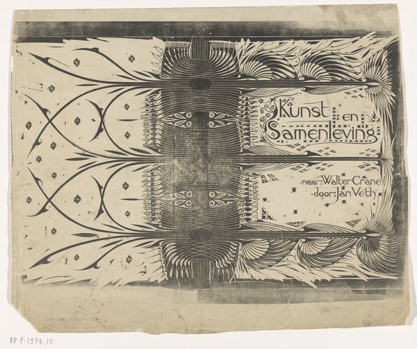
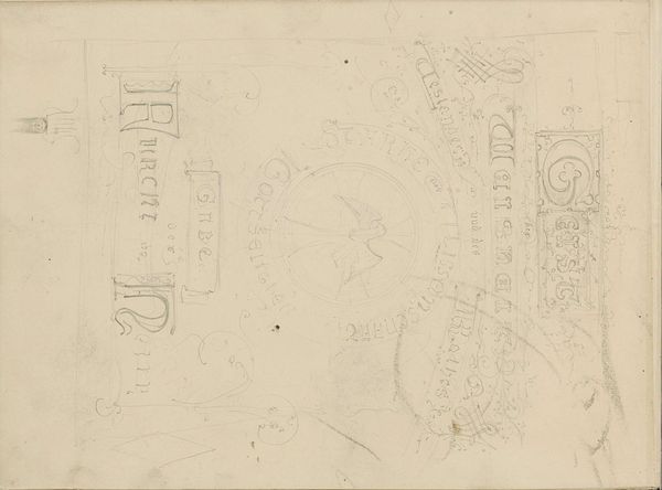
Bandontwerp voor: Max Rooses, De teekeningen der Vlaamsche meesters 1900 - 1915
0:00
0:00
drawing, graphic-art, paper, typography, ink, poster
#
drawing
#
graphic-art
#
art-nouveau
#
paper
#
typography
#
ink
#
poster
Dimensions: height 333 mm, width 559 mm
Copyright: Rijks Museum: Open Domain
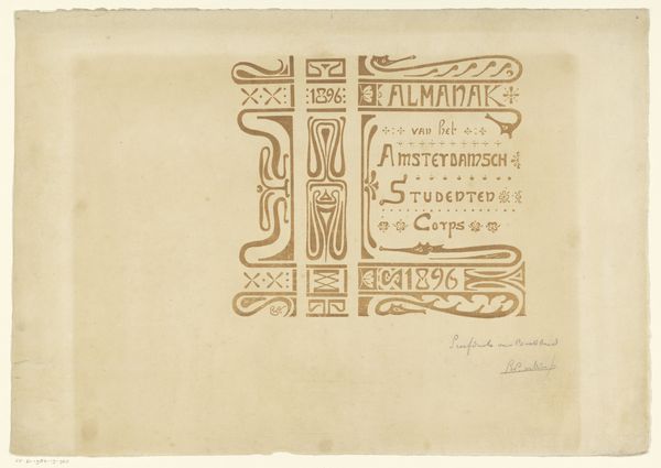
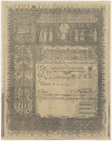
Curator: Before us is "Bandontwerp voor: Max Rooses, De teekeningen der Vlaamsche meesters," a design by Johann Georg van Caspel created between 1900 and 1915. It is crafted with ink on paper, representing a fascinating intersection of drawing, typography, and poster art. Editor: It gives an instant impression of meticulous planning. The grid-like structure and delicate floral motifs feel balanced, but there’s a rawness to the medium, like looking at something behind the scenes. Curator: Absolutely, you're seeing the blueprint of fin-de-siècle publishing aesthetics. Van Caspel’s design aimed to elevate Max Rooses’ work—Rooses being an important figure in the promotion of Flemish art history, it served to legitimize this focus as an area of art historical investigation. The poster embodies the emerging industrial capacity for image production, but through a distinctly artistic lens. Editor: What strikes me are the repeated stylized botanical forms. They suggest both a reverence for nature and an attempt to domesticate it through art, encapsulating the sentiments of Art Nouveau, even hinting towards art and craft as moral questions. The plant symbolism lends a sense of organic growth to what is fundamentally a textual object. Curator: And note how these floral elements create a frame for the text, directing our eye. "De Teekeningen der Vlaamsche Meesters," The Drawings of the Flemish Masters. These stylized emblems simultaneously signify artistic heritage and reinforce Rooses’ authoritative role in defining it. The text hierarchy suggests his key place in the cultural memory around flemish painting. Editor: Right. It's interesting to consider the cultural memory this object attempts to construct. Beyond simply advertising a book, the design positions Flemish art as a valuable and meticulously curated field of knowledge. This focus reinforces regional identity in the late 19th and early 20th century, during times of nation-building. Curator: Exactly. The work embodies how, through typography and design, publishing actively shapes the reception and canonization of art historical narratives. Editor: Well, viewing it this way casts a revealing light on the politics embedded within design itself. Thank you! Curator: Indeed, a good reminder that aesthetic choices are rarely neutral.
Comments
No comments
Be the first to comment and join the conversation on the ultimate creative platform.
More like this