Omslagontwerp voor: De Nederlandsche handel en nijverheid in woord en beeld, 1901 before 1901
0:00
0:00
#
aged paper
#
parchment
#
old engraving style
#
retro 'vintage design
#
wood background
#
tea stained
#
ink colored
#
golden font
#
word imagery
#
historical font
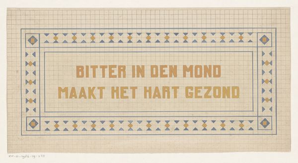
Dimensions: height 377 mm, width 268 mm
Copyright: Rijks Museum: Open Domain
This is a cover design, made by Johann Georg van Caspel around 1901, likely with watercolor and ink. The muted colors—pale greens and soft browns—give it a kind of hushed elegance, like a secret garden. There's this beautiful tension between the rigid formality of the heraldic imagery and the organic, flowing lines of the foliage. Look at how the leaves and berries curl and twist, almost as if they're alive, reaching out to soften the hard edges of the shields. I love how the artist used these delicate lines to create depth, layering the leaves and berries to give the impression of a lush, overgrown border. It reminds me of some of the Art Nouveau designs of the period, but with a uniquely Dutch sensibility. It's like glancing at a piece by Jan Toorop, if he decided to design bookplates for royalty. Ultimately, it shows that even the most official images can have a personal, almost whimsical touch.
Comments
No comments
Be the first to comment and join the conversation on the ultimate creative platform.
More like this