drawing, print, ink, engraving
#
pen and ink
#
drawing
#
dutch-golden-age
# print
#
ink
#
geometric
#
engraving
Dimensions: height 180 mm, width 217 mm
Copyright: Rijks Museum: Open Domain
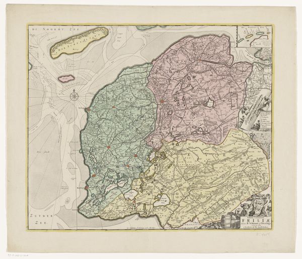
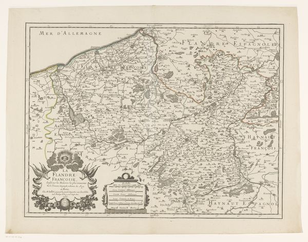
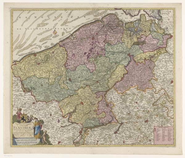
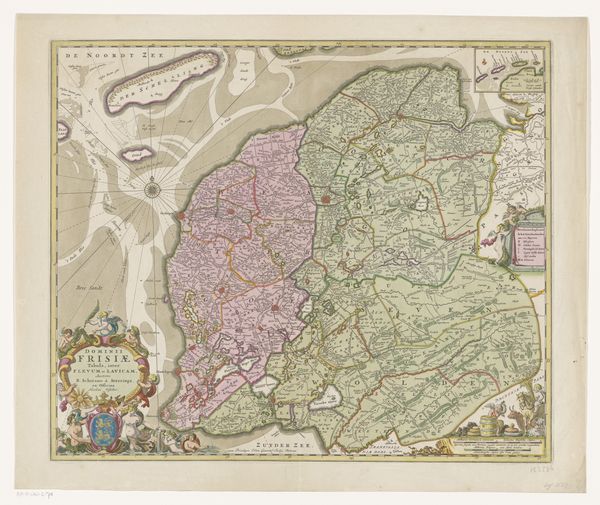
Hendrik Kloekhoff's "Kaart van Friesland" presents a cartographic depiction of the Friesland province. The map employs delicate lines and muted earth tones to render its geographical contours. The overall composition balances negative space with concentrated areas of topographical and textual information, creating a visually rich surface. Notice how Kloekhoff uses color sparingly, primarily to demarcate boundaries and highlight key features. The strategic use of color not only aids in differentiating territories but also introduces a semiotic layer, wherein colors may signify ownership or importance. The lines denoting borders are not merely objective boundaries; they suggest the imposition of human order onto the natural landscape. Consider how the map itself functions as a representation of power and knowledge. Through its formal organization, the map presents a particular view of space and territory, implying a structured understanding of the world. The inclusion of text labels reinforces this order, fixing place names as signs within a cartographic language. This is not just a neutral depiction of space, but a deliberate construction of meaning.
Comments
No comments
Be the first to comment and join the conversation on the ultimate creative platform.
More like this