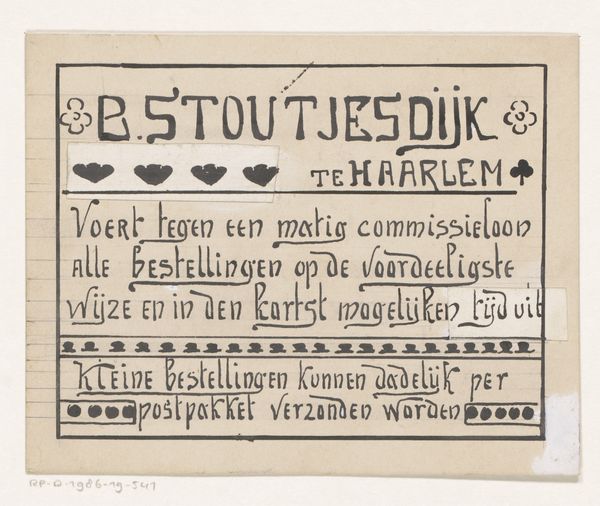
Ontwerp voor een titelhoofd van het maandblad van magazijn De Koning van Zweden 1884 - 1952
0:00
0:00
graphic-art, print, typography, poster
#
graphic-art
#
art-nouveau
#
hand-lettering
# print
#
old engraving style
#
hand drawn type
#
hand lettering
#
personal sketchbook
#
typography
#
hand-drawn typeface
#
fading type
#
thick font
#
sketchbook drawing
#
handwritten font
#
poster
Dimensions: height 173 mm, width 269 mm
Copyright: Rijks Museum: Open Domain
Curator: Here we have an intriguing piece entitled "Ontwerp voor een titelhoofd van het maandblad van magazijn De Koning van Zweden"—or, "Design for the title page of the monthly magazine of the De Koning van Zweden warehouse." It's a work by Reinier Willem Petrus de Vries, likely created sometime between 1884 and 1952, given the artist's lifespan. Editor: It's got this beautifully old-fashioned feel—a whiff of smoky printing presses and elegant storefronts. The lettering itself feels… stately, almost regal. I can almost hear the rustle of taffeta from here! Curator: Indeed. The formal construction adheres to the principles of Art Nouveau. Note the symmetrical arrangement, the use of thick and thin lines to create visual rhythm, and the incorporation of ornamental flourishes that both frame and draw attention to the central text. The statue of the Swedish King gives it such a historic look. Editor: Yes! That little engraving adds so much character. It grounds the entire design. Though I confess, I initially saw him as a Dutch merchant! I love the way the address and telephone number are incorporated into the design. They almost look like secrets hidden within the larger decorative framework. This "store front" really feels complete in terms of a visual experience for its target market. Curator: The piece exemplifies the use of typography as an art form. The text isn't merely informative, but a key visual component that works in harmony with the overall design. Note the weighting given to ‘De Koning van Zweden’; its prominence reflecting the store's brand identity. The handwritten typeface introduces a unique touch as well, making the storefront personable with "human-created font." Editor: And despite the formality, it possesses a certain… warmth, perhaps. The fading quality adds to that aged character. Almost a bit ironic, it is called an advertisement but feels like a personal gift of the designer to their client, it must've felt that special back then! Curator: An astute observation. Its aged appearance offers a lens through which we can view its historical significance as well as its creative intent. A fascinating synthesis. Editor: It really is. I think I'm actually picturing browsing through this monthly magazine in a charming bookstore! Such lovely window to a charming commercial moment!
Comments
No comments
Be the first to comment and join the conversation on the ultimate creative platform.
More like this