Titelhoofd voor: Bouwkundig weekblad, orgaan van de maatschappij tot bevordering d. bouwkunst 1895
drawing, graphic-art, print, paper, typography, woodcut, poster
drawing
graphic-art
art-nouveau
paper non-digital material
paper
typography
woodcut
poster
Dimensions: height 156 mm, width 239 mm
Copyright: Rijks Museum: Open Domain
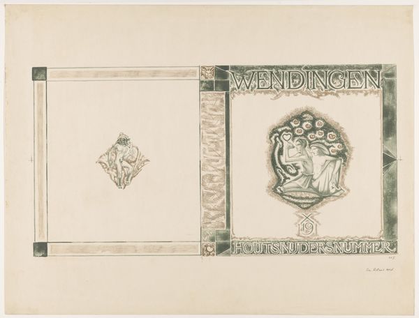
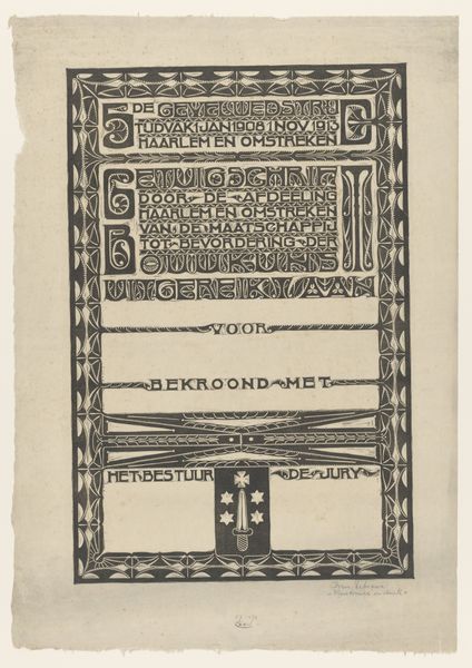
This title page for "Bouwkundig Weekblad," or Architectural Weekly, was designed by Karel Petrus Cornelis de Bazel. It's a woodcut print; a relief process where the artist carves away the negative space, leaving the design to be inked and printed. Consider the labor involved. Every line, every letter, meticulously cut into the wood. The material itself, wood, has a direct influence on the artwork's appearance. The texture of the grain, the resistance of the material to the cutting tools, all contribute to the final image. De Bazel engages with the skilled tradition of woodcutting, taking it beyond mere reproduction into the realm of art. The bold lettering and symbolic imagery, while communicating information, also possess a distinct aesthetic quality. The social context is key. This wasn't just about disseminating architectural news; it was about elevating the status of architecture and design in Dutch society. By understanding its materials, the making process, and its original context, we see how it transcends the boundary between craft and fine art.
Comments
No comments
Be the first to comment and join the conversation on the ultimate creative platform.