Ontwerp voor een beeldmerk van de Vereniging ter Bevordering van de Belangen des Boekhandels 1884 - 1952
0:00
0:00
drawing, graphic-art, paper, typography, ink
#
drawing
#
graphic-art
#
art-nouveau
#
paper
#
typography
#
ink
#
geometric
Dimensions: height 88 mm, width 286 mm
Copyright: Rijks Museum: Open Domain
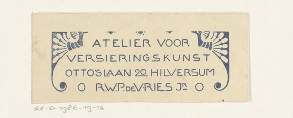
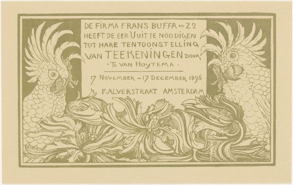
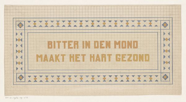
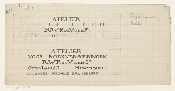
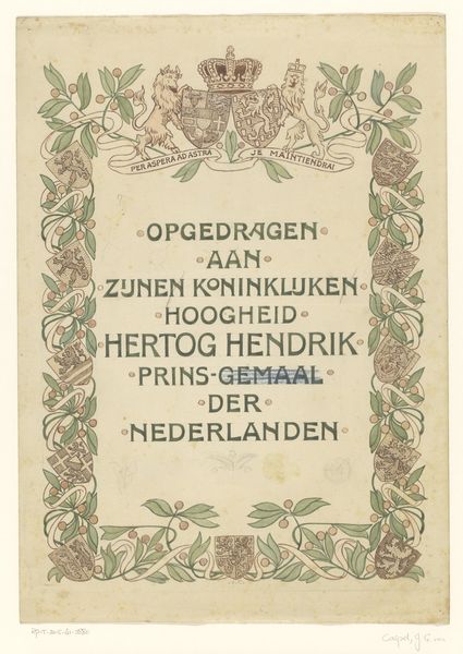
Reinier Willem Petrus de Vries created this design for a logo for a bookseller's association using an unknown medium. What stands out immediately is the use of a muted green against a beige backdrop. The simplicity speaks to an interest in modernist design. The design consists of an inscription of the organization's name across three lines. The inscription's encasement features a slight concavity on either side, adding a subtle architectural dimension to the emblem. This geometrical element adds a layer of complexity. One might consider the structuralist idea that meaning is derived not just from the content but from the system of relations. Here, the text provides the explicit message, yet the abstract form communicates the underlying values. The design leaves us to consider how form and function unite to represent the values of a booksellers' association. The logo is more than a label: it's an invitation to decipher how design shapes meaning.
Comments
No comments
Be the first to comment and join the conversation on the ultimate creative platform.
