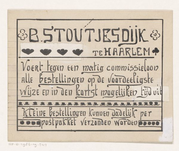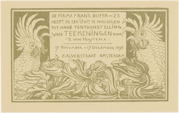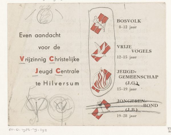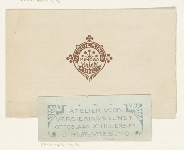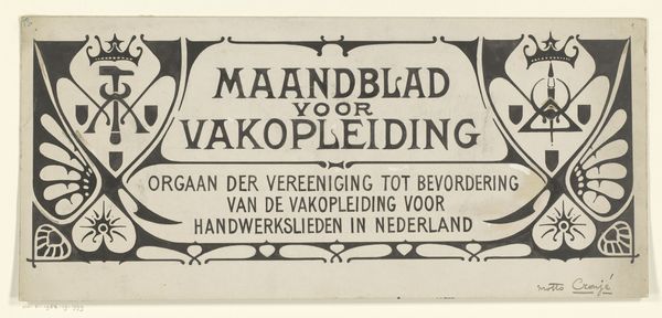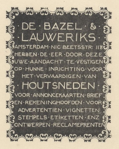
Vignet van Atelier voor Versieringskunst te Hilversum 1884 - 1952
0:00
0:00
drawing, graphic-art, typography, pen, poster
#
drawing
#
graphic-art
#
art-nouveau
#
hand-lettering
#
old engraving style
#
hand drawn type
#
hand lettering
#
personal sketchbook
#
typography
#
hand-drawn typeface
#
fading type
#
pen work
#
sketchbook drawing
#
pen
#
poster
#
sketchbook art
Dimensions: height 56 mm, width 153 mm
Copyright: Rijks Museum: Open Domain
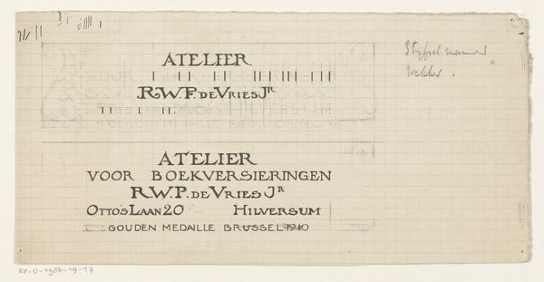
Curator: Right, let's look at this intriguing piece: it's titled "Vignet van Atelier voor Versieringskunst te Hilversum," created sometime between 1884 and 1952 by Reinier Willem Petrus de Vries. Editor: Well, first blush, it reminds me of those quirky title cards from silent films, or maybe the ornate signage outside an old-timey apothecary. A simple announcement brimming with character, but also an official letterhead. Curator: Exactly, it's a logo! Or, well, a 'vignet' for an Atelier—a studio—focused on decorative arts, located in Hilversum. You can make out the Art Nouveau flourishes on either side, and even its street address on Otto’s Laan. Think about it within the broader Arts and Crafts movement and the desire to elevate design and craft in everyday life. Editor: It’s beautifully balanced. The typography, while clear, isn’t just functional. It has a very hand-done feel. I’d almost say… friendly? It feels like it was designed by someone who deeply loved their craft and wanted to put that passion on display. Curator: That's de Vries for you. Someone dedicated to blending craft and commerce. Notice the careful composition, the way the typeface almost dances in the space. A lot of these smaller ateliers functioned at the intersection of marketing, art, and urban development at the turn of the century. Their design served as a type of placemaking and urban brand. Editor: There’s also a quaint elegance to it all, from the flourishes in the corners to the initials neatly tucked beneath the address. I think its charm lies in that contrast: formal business presented with real artistry, with hand-drawn imperfection that has more of a connection to humanity, which has real impact today in the world of clean graphics and design that are soulless. It serves its place and time beautifully. Curator: Agreed. It’s a glimpse into a particular moment where artistry touched the most quotidian aspects of commerce and everyday life, revealing their intersection in the street and its surroundings. A lost form that deserves to be admired as part of art history! Editor: Yes, what was once simply meant as signage on Otto’s Laan, this remains today as a poignant expression of something deeply personal, something of lasting artistry.
Comments
No comments
Be the first to comment and join the conversation on the ultimate creative platform.
