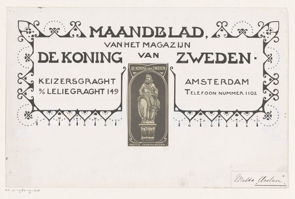
Ontwerp voor een titelhoofd van het Maandblad voor Vakopleiding 1884 - 1952
0:00
0:00
graphic-art, typography, pen, poster
#
graphic-art
#
art-nouveau
#
hand-lettering
#
hand drawn type
#
hand lettering
#
typography
#
pen work
#
pen
#
decorative-art
#
poster
Dimensions: height 208 mm, width 458 mm
Copyright: Rijks Museum: Open Domain
Curator: Ah, this title heading… It has such a potent and solid first impression on me! It feels... I don’t know… maybe a bit strict but reliable at the same time? What do you make of it? Editor: Well, looking at this "Ontwerp voor een titelhoofd van het Maandblad voor Vakopleiding," a design for the title heading of the ‘Journal for Vocational Training’, created by Reinier Willem Petrus de Vries somewhere between 1884 and 1952, I'm immediately drawn to how it frames artisanal labor within a context of societal structures and hierarchies. Curator: Exactly, the way he’s embedded little crowns and crests is doing a lot! Plus all those geometric shapes… They look kinda Masonic to me, no? Maybe something related to workers’ guilds? Editor: That's right! Consider that in the late 19th and early 20th centuries, the debates around vocational training were tied to anxieties about industrialization, social mobility, and the role of craft in a rapidly changing economy. De Vries' design doesn't just decorate a title; it makes a statement about the value and importance of skilled labor in shaping Dutch society. Curator: I never would’ve made this many connections… The boldness of the Art Nouveau lettering too—I mean the graphic design makes the skills talked about so official, somehow. All done in simple penwork. And all for artisans! It almost feels subversive when put that way. Editor: Precisely! And don't overlook how Art Nouveau, with its emphasis on handcrafted beauty, became entangled with ideas of national identity, economic progress, and social reform, infusing even functional designs like this with ideological weight. It really captures this cultural tension perfectly. Curator: It’s like de Vries is trying to legitimize the trades! He made the workers into people who could run a country just as well. All these connections from a humble title page... Now, when you look closer at all those Art Nouveau curls and precise corners—wow—a great commentary right under my nose! Editor: It reminds us that even the seemingly smallest design choices can embody entire social and historical universes, speaking volumes about who we are and where we are going. It really provides powerful stuff for critical discourse. Curator: I love how even simple artwork has hidden commentary about cultural standards. Makes my view broaden!
Comments
No comments
Be the first to comment and join the conversation on the ultimate creative platform.
More like this