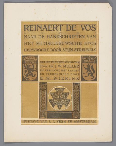
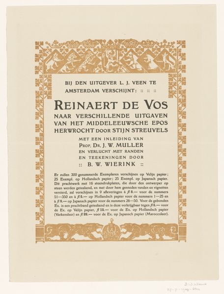
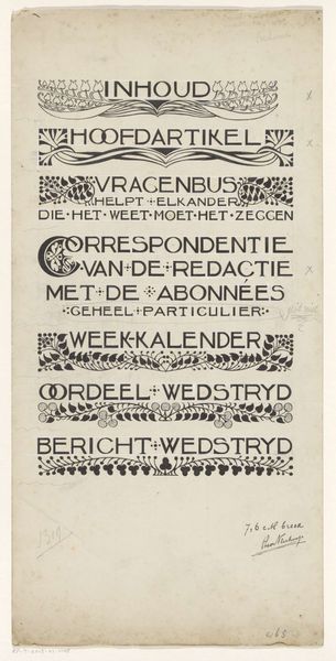
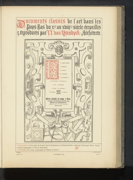
Ontwerp voor titelpagina voor: Stijn Streuvels, Reinaert de Vos, 1910 c. 1910
0:00
0:00
bernardwillemwierink
Rijksmuseum
graphic-art, textile, typography, poster
#
graphic-art
#
type repetition
#
aged paper
#
art-nouveau
#
homemade paper
#
yellowing background
#
parchment
#
old engraving style
#
textile
#
retro 'vintage design
#
typography
#
golden font
#
decorative-art
#
poster
#
historical font
#
columned text
Dimensions: height 240 mm, width 181 mm
Copyright: Rijks Museum: Open Domain
Bernard Willem Wierink designed this title page for ‘Reinaert de Vos’ in 1910 with ink and graphite. There’s something about this design that feels ancient, yet totally modern. It's like he’s reaching back to medieval manuscripts but doing it with the crispness of early twentieth-century graphic design. Look at the colours; that tan colour feels so warm. The way he plays with symmetry and repeating patterns, it’s almost hypnotic. The dark ink work is not about perfection. You can see the hand in it, the little wobbles and inconsistencies. That's where the magic is, right? It’s like he's reminding us that art is made by humans, not machines. I see echoes of William Morris. But Wierink takes it somewhere else, into a more stylised, graphic space. It reminds us that art is a conversation across time. It's about taking what came before and turning it into something new.
Comments
No comments
Be the first to comment and join the conversation on the ultimate creative platform.
More like this