Copyright: Rijks Museum: Open Domain
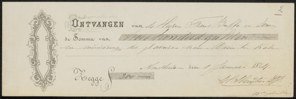
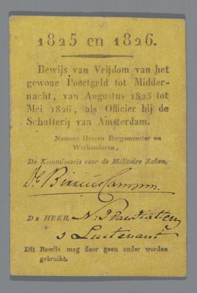
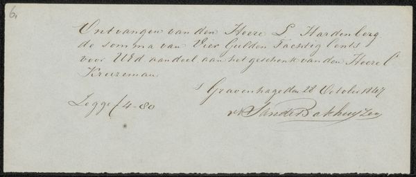
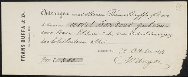
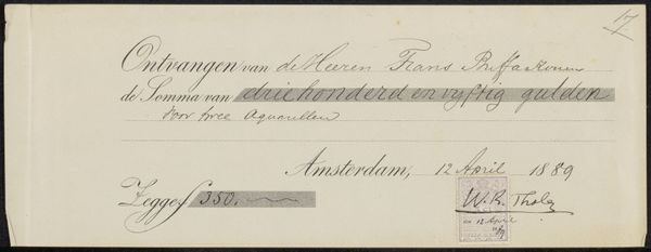
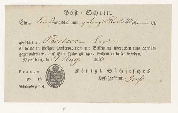
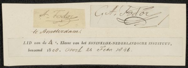
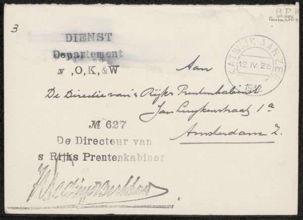
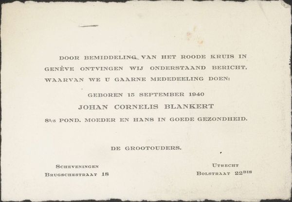
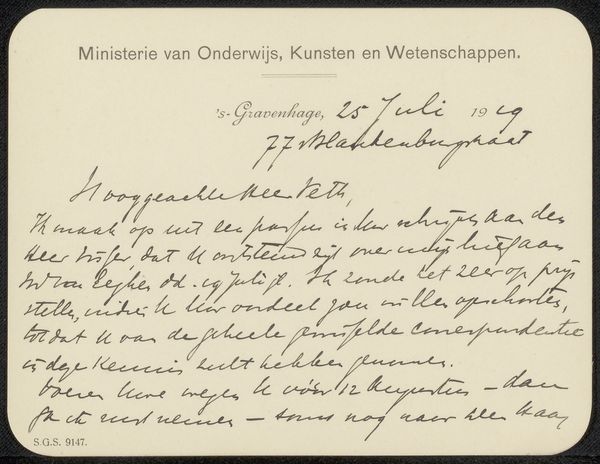
Editor: This is "Brief aan A.D. Schinkel," made sometime between 1827 and 1892 by Everhardus Koster. It's ink on paper. The inscription dominates the composition, it appears somewhat simple. How do you see it? Curator: I see a compelling example of textual art where the interplay between script and space defines its aesthetic. Note how the rigid print contrasts with the cursive signature and the confident flourishes underneath. This opposition creates visual tension and dictates the flow of the viewer’s eye. Editor: Visual tension, yes! But beyond that, is there something that speaks to Koster's use of ink specifically? Curator: Precisely! The choice of ink, with its varying densities, introduces depth. See the delicate hairlines in "E. Koster" against the bold strokes in "Kunstschilder"? The materiality is essential, offering gradations, shadow play, which animates the surface, preventing it from being merely informational. Editor: Interesting, I wouldn’t have considered the ink itself a design element! It's like Koster considered how he actually inscribed the message and signature. Curator: Exactly! The materiality provides structure to the entire composition, creating a beautiful dialogue, with script functioning as image. What is your read of this structure? Editor: The layering definitely gives a sense of curated construction…I am appreciating how Koster is presenting this work! Thanks! Curator: It underscores how paying attention to form yields fresh understanding of the intent.
Comments
No comments
Be the first to comment and join the conversation on the ultimate creative platform.
