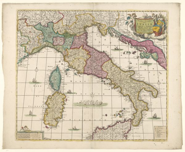
graphic-art, print, etching, engraving
#
graphic-art
#
baroque
# print
#
etching
#
asian-art
#
old engraving style
#
etching
#
history-painting
#
engraving
Dimensions: height 479 mm, width 554 mm
Copyright: Rijks Museum: Open Domain
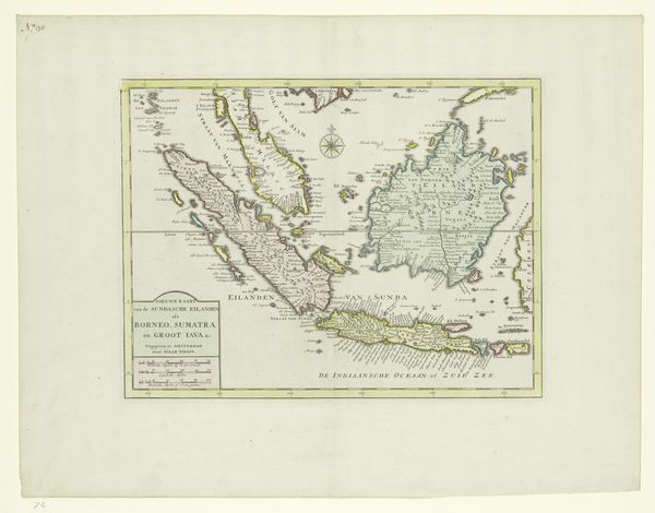
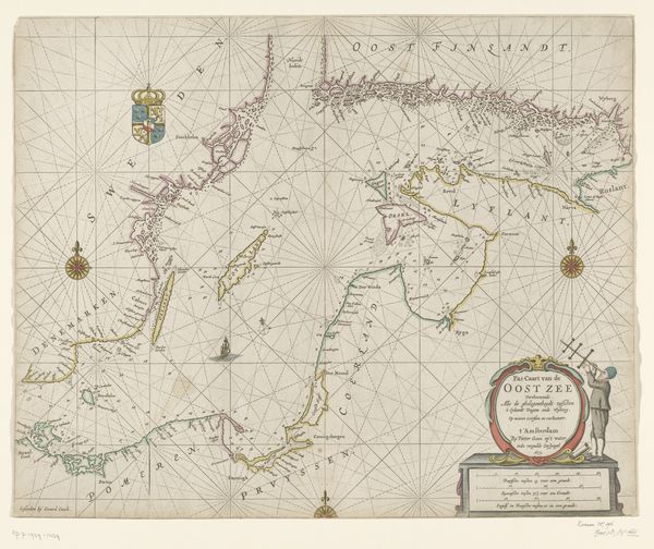
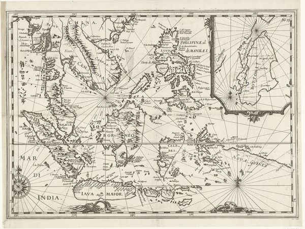
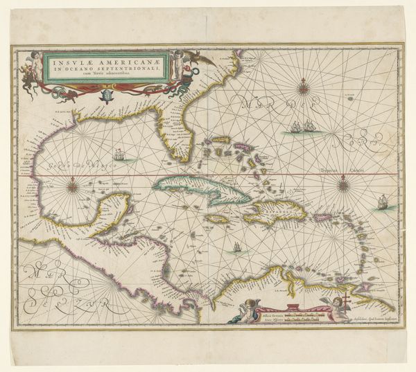
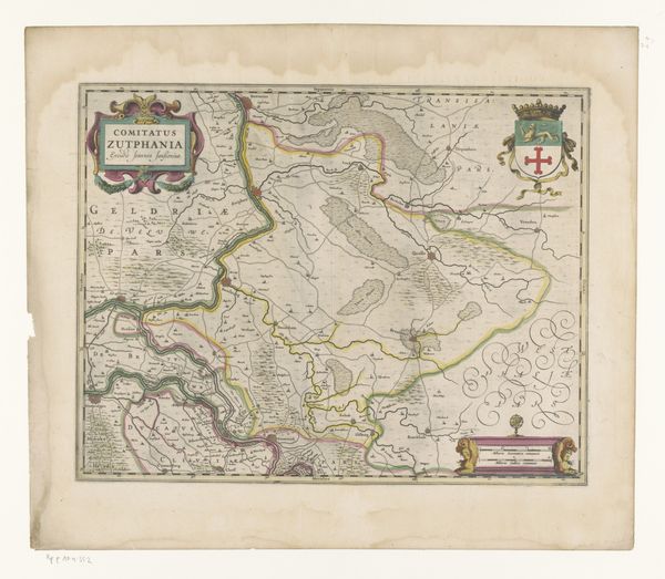
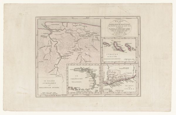
Editor: Here we have “Kaart van het Koninkrijk Siam (onderste helft)”, a map of Siam from between 1700 and 1750, created by Joachim Ottens. It's an etching and engraving. I find the delicacy of the lines and the subdued colour palette quite striking, especially for a map. How would you interpret this work? Curator: Consider first the interplay between line and colour. The rigid lines delineate geographical boundaries, while the pastel washes soften the overall effect, creating a visually interesting tension. The use of cartographic symbols also contributes to the work’s internal structure. Have you noticed how the engraver uses varied stippling techniques to create different textures, thereby defining land versus sea? Editor: I see that now. The stippling really gives the water depth. Curator: Exactly. The map functions as a system of signs; consider how each line, symbol, and colour carries specific information. Ottens employs a specific visual language, one common in Baroque cartography, to assert not just geographical knowledge, but a specific worldview. What statement do you think the artist makes about their world view? Editor: That's interesting... Maybe it reveals an ambition to organise and control knowledge, reflected in the systematic way he categorises the world through lines and symbols. Curator: Precisely. Furthermore, the precision of the engraving juxtaposed with the softer coloring reflects a cultural tension between the desire for scientific accuracy and aesthetic appeal. I had not considered the relationship between science and artistic desire before! Editor: That tension provides a lot to think about; how this visual system can both clarify and impose a certain structure.
Comments
No comments
Be the first to comment and join the conversation on the ultimate creative platform.
More like this