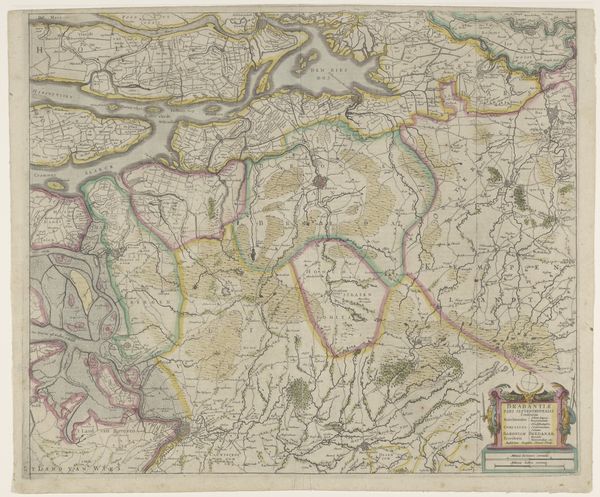
print, etching
#
baroque
# print
#
etching
#
landscape
#
etching
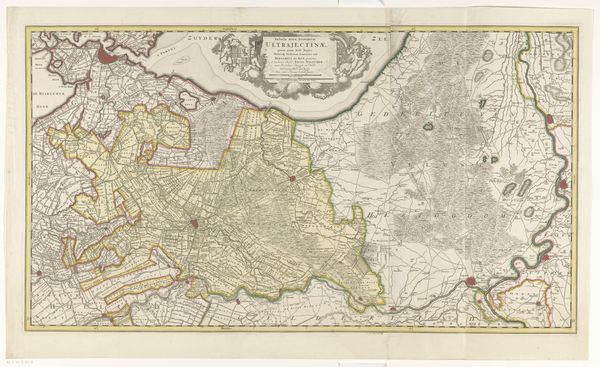
Dimensions: height 430 mm, width 562 mm
Copyright: Rijks Museum: Open Domain
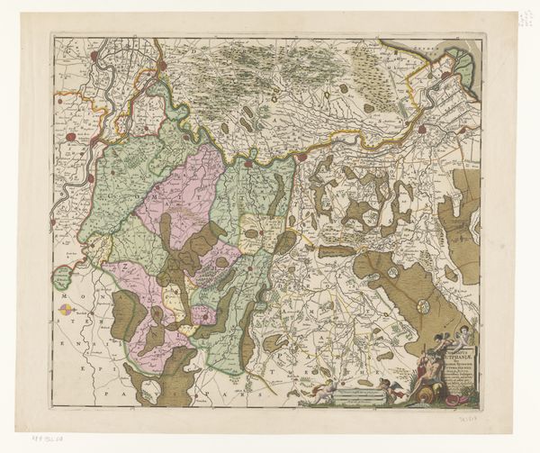
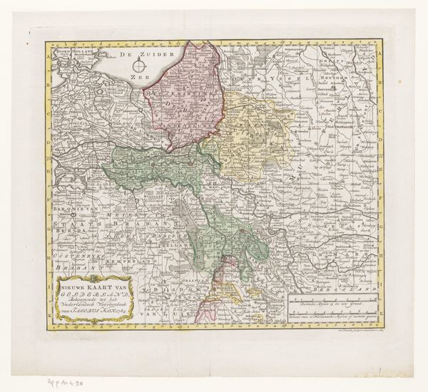
Editor: So, this is Pieter Mortier’s “Kaart van de provincie Utrecht” from 1696, an etching. The thing that strikes me most is how it documents land as property, meticulously divided and labeled. How do you see this from a materialist point of view? Curator: Well, think about what goes into creating this print: the mining of the copper for the plate, the craftsmanship required for engraving, the social structures that organize this knowledge and facilitate this project, and then the eventual trade and consumption. This wasn’t just an aesthetic endeavor. Editor: So the lines on the map represent not just borders, but economic and material realities? The pink shading highlights land use controlled and organized by ruling powers, and how access to such land was given to select citizens? Curator: Exactly! The map then becomes a document of power relations, reflecting labor divisions, resource management, and how landscape shapes our world and experiences within it. Editor: I hadn't considered the material process of making a map like this, it’s not just lines on paper. Curator: And each impression from the etching press bears that trace – copper, ink, paper, and labour are all interwoven to render something that seems merely representational. It actually presents the world for controlling the means of production. Editor: Fascinating. It reframes how I perceive historical objects. It's like peeling back layers of how things were made and their use within the socioeconomic landscape. Thank you.
Comments
No comments
Be the first to comment and join the conversation on the ultimate creative platform.
More like this