Prospectus van de 'Onze koloniën' reeks van Hollandia-drukkerij te Baarn 1913
0:00
0:00
graphic-art, typography, poster
#
graphic-art
#
art-nouveau
#
typography
#
orientalism
#
poster
Dimensions: height 222 mm, width 139 mm
Copyright: Rijks Museum: Open Domain
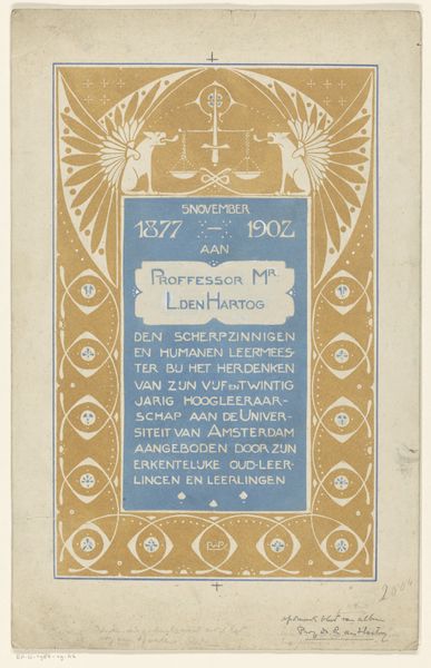
Curator: This is a prospectus, or advertisement, from 1913 by Reinier Willem Petrus de Vries. It promotes the 'Onze Koloniën' series from the Hollandia printing house in Baarn. It's a poster, a piece of graphic art employing typography, that we categorize under the Art Nouveau style with noticeable Orientalist influences. Editor: Striking! The blue and gold immediately suggest something both royal and…well, exotic, given the subject. It feels incredibly balanced in its symmetry, almost rigidly so. What strikes me most is how flat it is—very little depth created, which lends a powerful graphic punch. Curator: Indeed. The limited palette—primarily blues and yellows—creates a striking contrast and guides the viewer’s eye. The composition is structured around rectangular and curvilinear forms; observe the repeated use of borders framing text and the central figure. These lines create a clear hierarchy. Editor: The central figure, in stark white, is quite evocative. Given the title “Our Colonies," and the stylistic choice leaning towards Orientalism, this seated figure in meditation is almost certainly intended to symbolize some generalized Eastern ideal—perhaps drawing from Buddhist iconography. I sense a strong emphasis on otherness and a projection of colonial fantasies. Curator: That reading resonates, given the title's implications. Notice how the artist uses symmetry to project the idealized figure in a controlled, geometric fashion. Look at how the ornament serves both to frame the figure and add a superficial, almost appropriated, sense of the “exotic.” The surface of the poster, lacking texture or dimensionality, reinforces the poster's graphic intent. Editor: It's interesting how this "flatness" actually reinforces the exoticizing symbolism. By reducing cultural expression to pure surface—design and color choices—the poster flattens a rich set of cultural meanings, effectively rendering it a commodity for consumption. The calm and balanced formal choices ironically heighten that sense of imposed order, of colonial control. Curator: Yes, by emphasizing the purely visual components of the work, we've unearthed the poster's structural simplicity while acknowledging its potent cultural baggage. It seems De Vries utilizes visual strategies here as a marketing method as well as social and cultural projection. Editor: Precisely. It serves as a reminder of the cultural biases embedded even in seemingly innocuous design choices. There’s a certain gravity here in that tension.
Comments
No comments
Be the first to comment and join the conversation on the ultimate creative platform.
