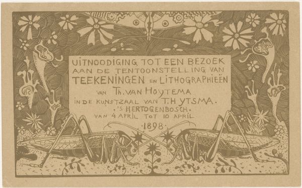
Omslag van de officiële feestgids ter gelegenheid van het koninklijk bezoek aan Amsterdam in 1901 1901
0:00
0:00
graphic-art, print, typography, poster
#
graphic-art
#
art-nouveau
# print
#
typography
#
decorative-art
#
poster
#
calligraphy
Dimensions: height 184 mm, width 121 mm
Copyright: Rijks Museum: Open Domain
Reinier Willem Petrus de Vries made this cover of the official festival guide in 1901 for the royal visit to Amsterdam. It's a lithograph, which is a printmaking technique using a flat stone or metal plate. The design is drawn onto the surface with a greasy substance, then inked and pressed onto paper. Here, the black ink sits proudly on the light brown paper. The choice of material affects the image; the design is bold, and graphic, because that's what lithography does well. The process is important here, because lithography was developed in the late 18th century as a cheaper method of printing. This meant images could be reproduced at scale. This cover, therefore, isn't just a pretty picture, it's a product of industrialization and consumer culture. The price of 10 cents printed on the cover tells us this was a commodity, made for mass consumption. So, next time you look at a print, remember it's not just the image that matters, but also how it was made, and how it circulated in society.
Comments
No comments
Be the first to comment and join the conversation on the ultimate creative platform.
More like this