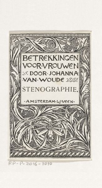
Brochure 'Stenografie voor iedereen' van uitgeverij S.L. van Looy te Amsterdam c. 1899 - 1938
0:00
0:00
#
type repetition
#
aged paper
#
hand-lettering
#
old engraving style
#
hand drawn type
#
hand lettering
#
fading type
#
thick font
#
handwritten font
#
word imagery
Dimensions: height 211 mm, width 169 mm, width 339
Copyright: Rijks Museum: Open Domain
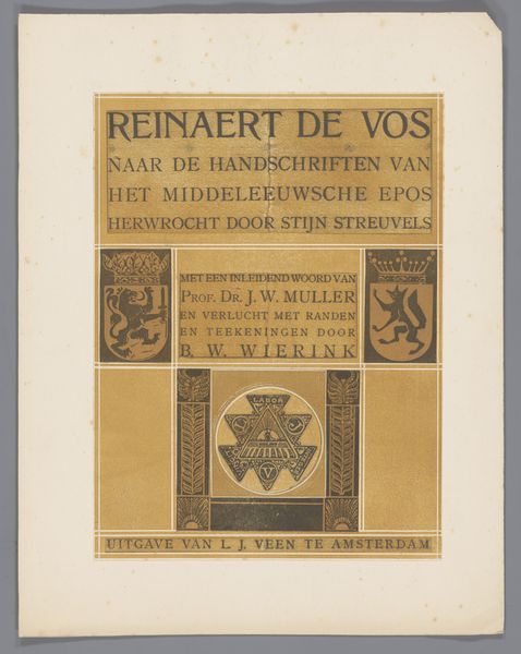
Artist: What a find! Here we have an antique brochure, dating roughly from 1899 to 1938. It is titled "Stenografie voor iedereen," which translates to "Shorthand for Everyone," published by S.L. van Looy in Amsterdam. The artist is Reinier Willem Petrus de Vries. Materialist: Immediately, my attention goes to the textures, the aged paper whispering tales of a time obsessed with efficiency. It’s intriguing how a seemingly utilitarian object like this brochure is adorned with such elaborate, almost floral, decorations. Look closely at the methods employed to put this artifact together and consider its life cycle as a piece of marketing. Artist: Oh, I love that frame of floral Art Nouveau around the lettering. The design exudes such quaint charm—a beautiful clash between practicality and elegance, all promising accessibility in an era hungry for self-improvement. Don't you find the faded ink comforting, too? Like a well-worn map promising untold adventures of productivity? Materialist: Comforting, perhaps, but it's crucial to view the faded ink as more than aesthetic—it's evidence of the physical limitations of early printing processes, which used hand lettering techniques to craft visual marketing products like this brochure. Moreover, a cheap, popular service promised here would reflect broad interest at this time. These techniques and distribution matter, and not by accident: printed ephemera like this could empower new people by expanding their literacy and professional abilities. Artist: I appreciate you situating it, yet I see this object speaking beyond utility. Think of the person painstakingly designing this pamphlet—imagining who would hold it. The flourish is the key here! The cover promises some stylish edge to offset labor. You could picture it, perhaps, displayed amidst lovely flowers! Materialist: Maybe so, yet these design decisions were undoubtedly impacted by material limitations and processes, and also reflected larger issues, like commercial growth or an emergent professional workforce. This impacts my interest. Artist: Absolutely! Well, on that note, I think both the personal artistry and collective shifts meet delightfully in a simple promotional artifact. Materialist: A compelling thought, especially considering what such a modest material form represented for cultural, and technological shifts.
Comments
No comments
Be the first to comment and join the conversation on the ultimate creative platform.
More like this